library(ggplot2) # the star of the day!

library(dplyr)
library(readr)

# source our utility functions so that we have them available
source("ibd_utils.R")

# download and process the metadata and IBD data set
metadata <- process_metadata(bin_step = 10000)
ibd_segments <- process_ibd()

# combine the IBD table with metadata information
ibd_merged <- join_metadata(ibd_segments, metadata)Visualization with ggplot2
Introduction
In this chapter, we will be delving into the data visualization R package called ggplot2, which is possibly the most famous piece of the tidyverse ecosystem. So much so that people who otherwise don’t use any tidyverse functions (or who don’t even use R for data analysis itself) still use ggplot2 for making figures. It really is that good.
Part 1: Visualizing patterns in our IBD data
First, let’s start from a clean slate, and leverage the modularized pipeline which is the final product of the second session on tidyverse (if it had to be skipped, it doesn’t matter). Create a new R script in RStudio (File -> New file -> R Script), and save it somewhere on your computer as tidy_viz.R (File -> Save). Copy the following bit of code into that script (it executes the pipeline just mentioned).
Now create another new R script, and save it as ibd_utils.R into the same directory as the just-created tidy_viz.R. Then copy-paste the contents of this file into ibd_utils.R and save it again.
And finally, run your entire script tidy_viz.R to execute the IBD processing pipeline. You should have the ibd_merged and metadata data frames ready for plotting (you will be adding your visualization code into this script):
head(metadata, 1)# A tibble: 1 × 9
sample country continent age coverage longitude latitude y_haplo age_bin
<chr> <chr> <chr> <dbl> <dbl> <dbl> <dbl> <chr> <fct>
1 NA18486 Nigeria Africa 0 NA NA NA <NA> present-d…head(ibd_merged, 1)# A tibble: 1 × 18
sample1 sample2 country_pair region_pair time_pair chrom start end rel
<chr> <chr> <chr> <chr> <chr> <dbl> <dbl> <dbl> <chr>
1 VK548 NA20502 Norway:Italy Europe:Europe (0,10000]:… 21 58.3 62.1 none
# ℹ 9 more variables: length <dbl>, country1 <chr>, continent1 <chr>,
# age1 <dbl>, age_bin1 <fct>, country2 <chr>, continent2 <chr>, age2 <dbl>,
# age_bin2 <fct>As in our tidyverse session, whenever you’re done experimenting in the R console (such as when you finish a particular figure), always record your solution in your R script. Again, I recommend separating code for different exercises with comments, perhaps something like this:
########################################
# Exercise 1 solutions
########################################
Now let’s get started!
Exercise 1: Concept of layers
A fundamental (and at the time groundbreaking) concept of building visualizations using ggplot2 is the idea of “layering”. We will begin introducing this idea from the simplest possible kind of visualization, which is plotting the counts of observations of a categorical (i.e. discrete) variable, but first, what happens when you execute a function ggplot() on its own? How about when you run ggplot(metadata), i.e. when we tell ggplot() we want to be plotting something from out metadata table (but give it no other information)?
Note: We showed a demonstration of this in the introductory slides, but it’s important that you try this yourself too.
NoteClick to see the solution
We get an empty “canvas”! Almost as if we were an artist starting to paint something, to use a slightly pretentious metaphor.
ggplot()
Saying that we want to plot metadata doesn’t actually change anything. We get the same empty canvas, with ggplot2 basically waiting for us to give it more instructions.
ggplot(metadata)
As mentioned in my solution, calling ggplot() on its own basically only sets up an empty “canvas”, as if we were about to start painting something.
This might sound like a silly metaphor, but when it comes to ggplot2 plotting, this is actually remarkably accurate, because it is exactly how the above-mentioned idea of the “layering grammar” of ggplot2 works in practice.
There are two important components of every ggplot2 figure:
1. “Aesthetics”
Aesthetics are a specification of the mapping of columns of a data frame to some kind of visual property of the plot we want to create (position along the x, or y axes, color, shape, etc.). We specify these mapping aesthetics with a function called aes() which you will see later many times.
2. “Geoms”
Geoms are graphical elements to be plotted (histograms, points, lines, etc.). We specify those using functions such as geom_bar(), geom_histogram(), geom_point(), and many many others.
How do “aesthetics” and “geoms” fit together?
We can think about it this way:
- “geoms” specify what our data should be plotted as in terms of “geometrical elements” (that’s where the name “geom” comes from)
- “aesthetics” specify what those geoms should look like (so, the aesthetic visuals features of geoms, literally)
Exercise 2: Distribution of a categorical variable
Let’s start very simply, and introduce the layering aspect of the ggplot2 visualization package step by step. Our metadata data frame has a column age_bin, which contains the assignment of each individual into a respective time period. Let’s start by visualizing the count of individuals in each of those time bins.
Run the following code in your R console. It specifies the aesthetic mapping which will map our variable of interest (column age_bin in our data frame) to the x-axis of our eventual figure. What do you get when you run it? How is the result different from just calling ggplot(metadata) without anything else, like you did above?
ggplot(metadata, aes(x = age_bin))
NoteClick to see the solution
Let’s take it step by step:
- Again, saying what data set we want to plot doesn’t do anything (ggplot2 doesn’t know what to plot yet!):
ggplot(metadata)
- A-ha! Now we see a difference! ggplot2 now mapped the
xaxis against values of theage_binvariable.
ggplot(metadata, aes(x = age_bin))
But even then, the plot still actually doesn’t show anything! Remember, we only instruct ggplot2 to map a variable age_bin to an x-axis of a figure… but we didn’t say what we want to visualize (i.e. a “geom”).
To make a visualization, both aesthetic mapping and some kind of geom are needed! We will do this in the next step.
geom_bar()
In the previous exercise, you instructed ggplot() to work with the metadata table and you mapped a variable of interest age_bin to the x-axis (and therefore set up a “mapping aesthetic”). To make a complete figure, you need to add a layer with a “geom”. In ggplot2, we add layers with the + operator, mimicking the “painter metaphor” of adding layers one by one, composing a more complex figure with each additional layer.
Add the + geom_bar() layer on the same line after the ggplot(metadata, ...) command from the previous exercise, and run the whole line. What happens then? How do you interpret the result? Compare then to what you get by running table(metadata$age_bin).
NoteClick to see the solution
We get a full figure, yay!
ggplot(metadata, aes(x = age_bin)) + geom_bar()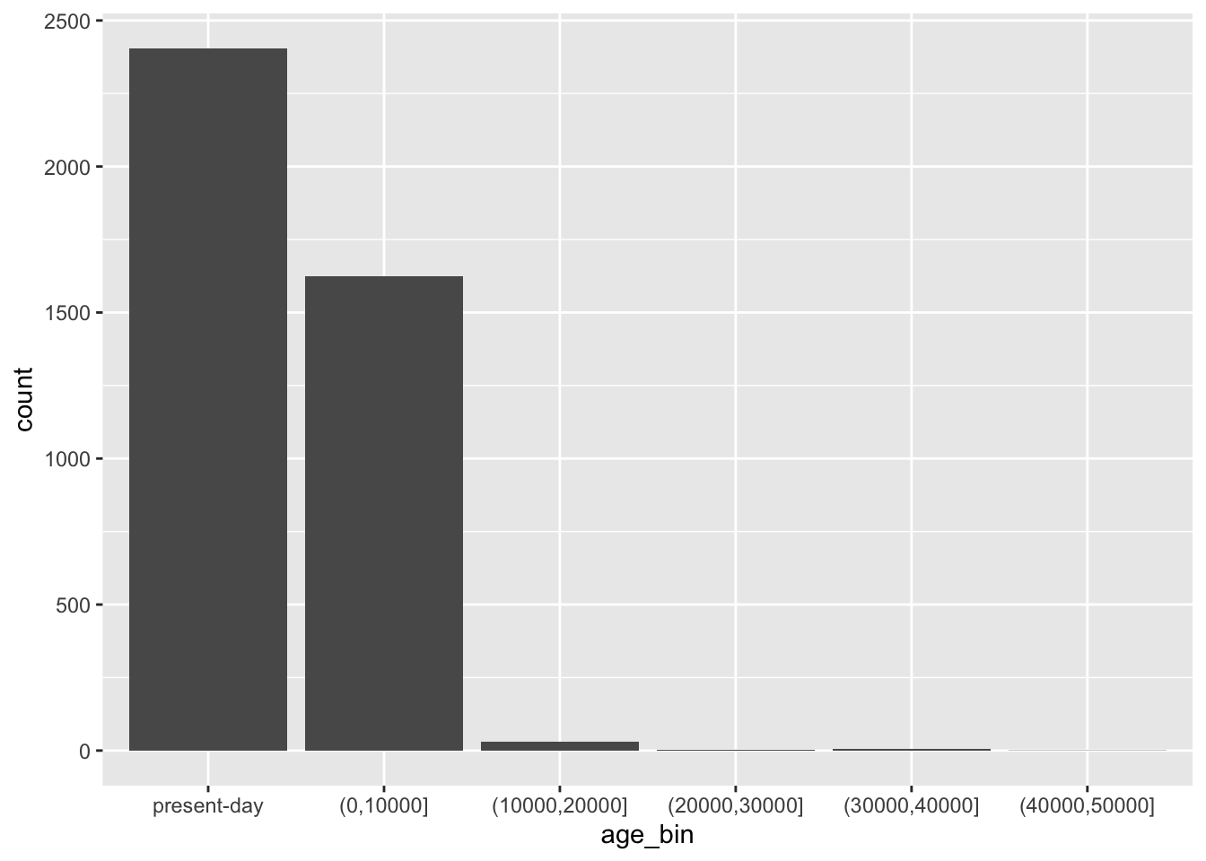
This bar plot indeed matches the counts in our data:
table(metadata$age_bin)
  present-day     (0,10000] (10000,20000] (20000,30000] (30000,40000]
         2405          1623            31             2             7
(40000,50000]
            1
It might be hard to believe now but you now know almost everything about making ggplot2 figures. 🙂 Everything else, all the amazing variety of the possible ggplot2 figures (really, look at that website!) comes down from combining these two simple elements: aesthetics and geoms.
Let’s demonstrate the layering aspect a little bit more by adding more layers to our figure! Use a xlab() function to add an x-axis label element to your bar plot code above, again using the + operator. Look at ?xlab to see how to use this function in practice. What changed about your figure now?
NoteClick to see the solution
Just as we did with tidyverse %>% data transformation pipelines, as a ggplot2 visualization pipeline gets more complex, it’s a good idea to introduce indentation so that each visualization steps is on its own line.
ggplot(metadata, aes(x = age_bin)) +
  geom_bar() +
  xlab("Time period [years before present]")
By default, x and y axes are labeled by the data-frame column name specified for that x or y axis in the aes() mapping. xlab() overrides that default.
Now continue adding another layer with the ylab() function, giving the plot proper y-axis label too.
NoteClick to see the solution
ggplot(metadata, aes(x = age_bin)) +
  geom_bar() +
  xlab("Time period [years before present]") +
  ylab("Number of individuals")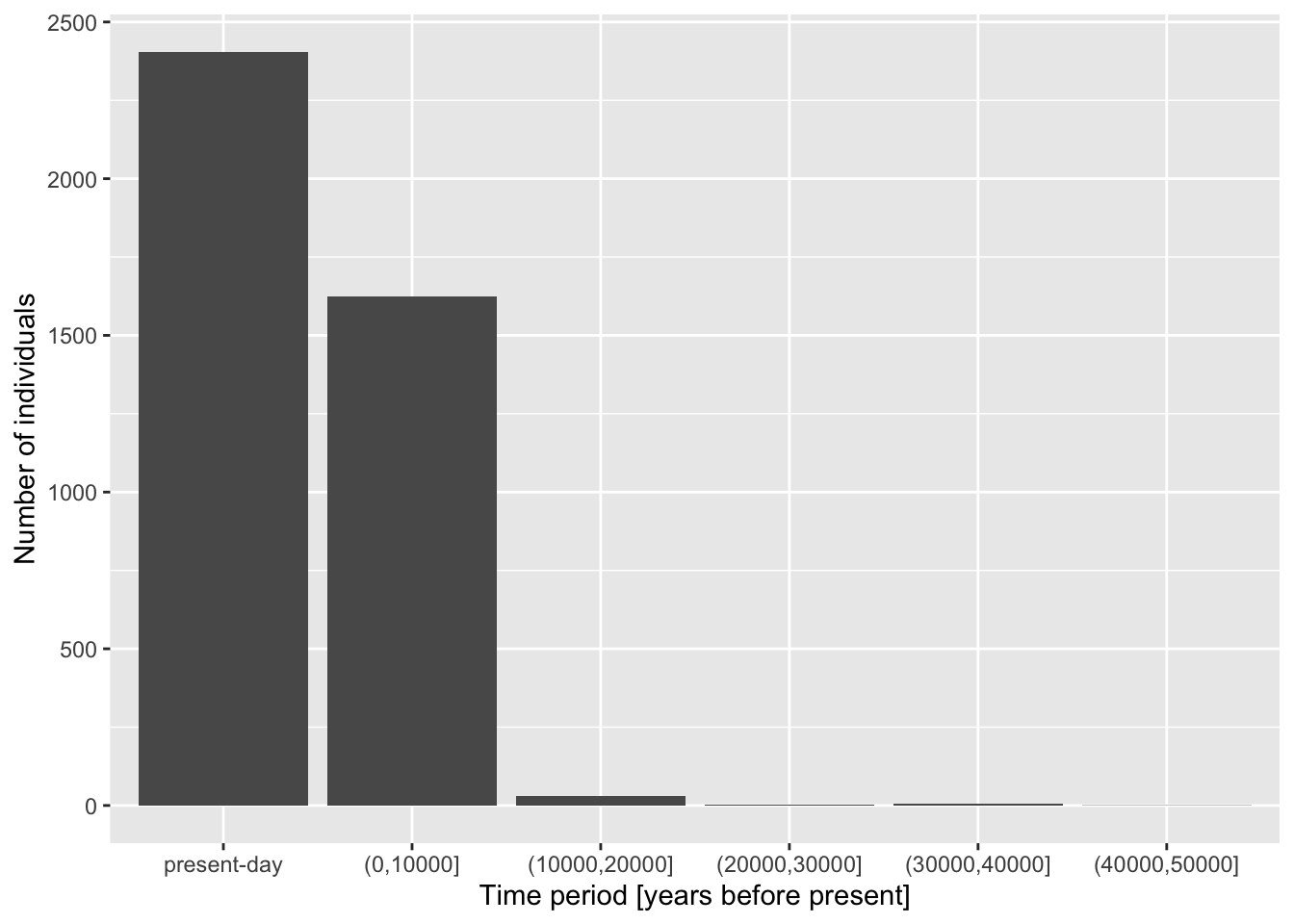
Give your figure a proper main title using the function ggtitle() (again, use help ?ggtitle if you need to).
NoteClick to see the solution
ggplot(metadata, aes(x = age_bin)) +
  geom_bar() +
  xlab("Time period [years before present]") +
  ylab("Number of individuals") +
  ggtitle("Distribution of sample counts in each time period")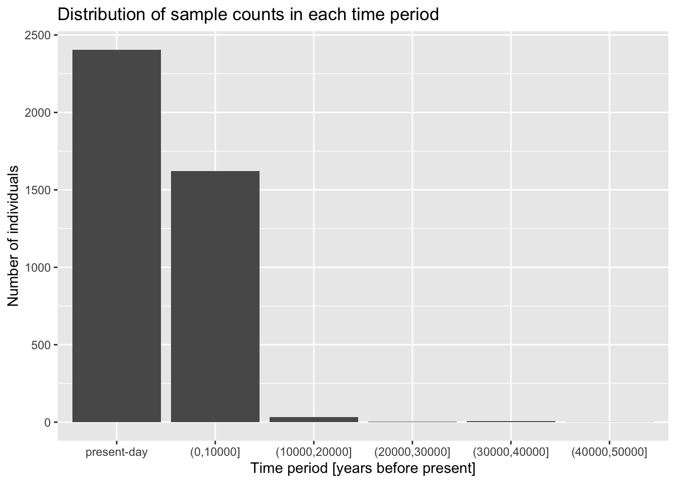
Although individual functions xlab(), ylab(), ggtitle() are useful, oftentimes it’s better to use a general function labs(). Look up its documentation under ?lab, then rewrite the code for your figure to use only this function, replacing your uses of xlab(), ylab(), and ggtitle() just with labs(). Note that the function has other useful arguments—go ahead and use as many of them as you want.
Note: Don’t worry about making your figure cluttered with too much text, this is just for practice. In a real paper, you wouldn’t use title or caption directly in a ggplot2 figure, but it’s definitely useful for work-in-progress reports at meetings, etc.
NoteClick to see the solution
ggplot(metadata, aes(x = age_bin)) +
  geom_bar() +
  labs(
    y = "Number of individuals",
    x = "Time period [years before present]",
    title = "Distribution of sample counts in each time period",
    subtitle = "Counts for individuals in 1000 Genomes Project and MesoNeo data",
    caption = "Here is an optional caption for the figure, similarly to what
      you might do in a real scientific article as a more detailed description of
      of what is going on in the plot."
  )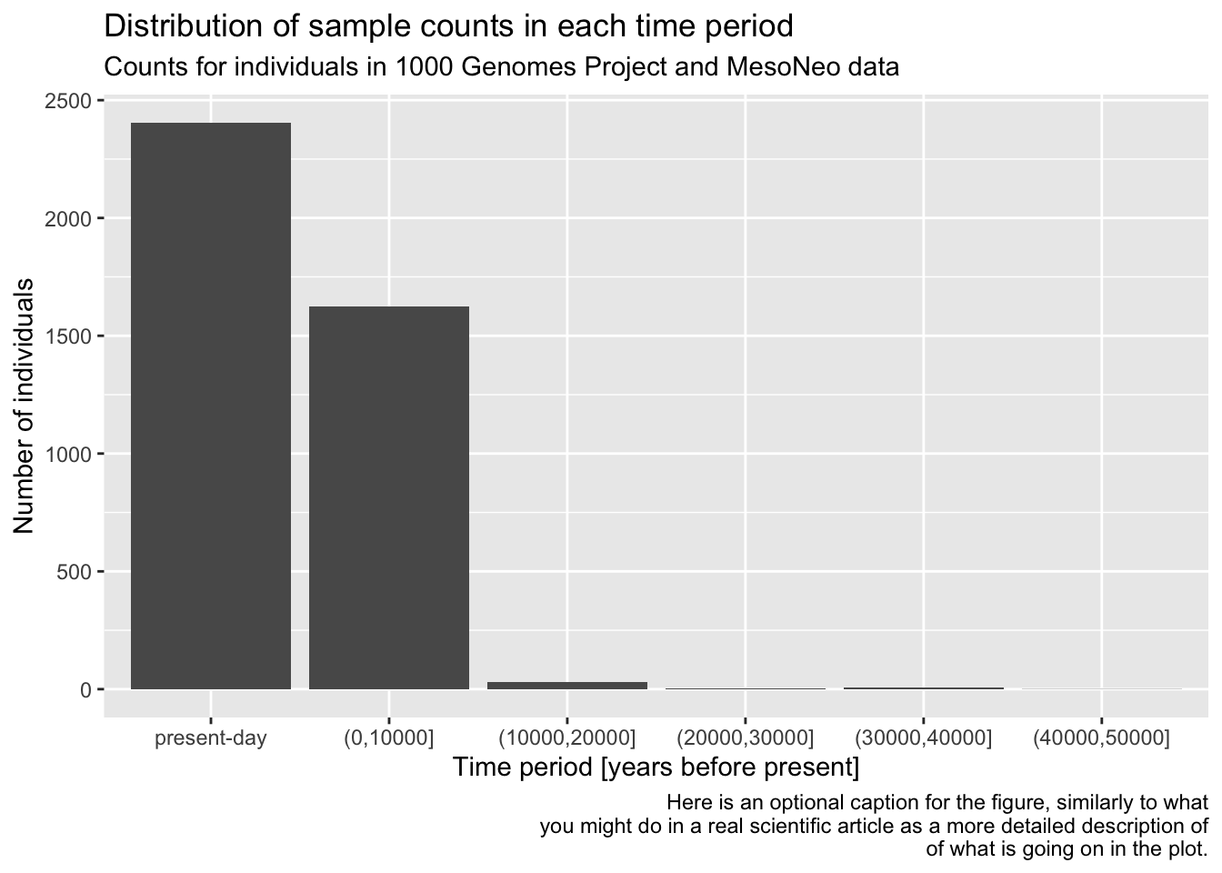
You can see that the “present-day” bin completely overwhelms the number of individuals in the oldest bins. This often happens with data which follow a more or less exponential scale. A useful trick is adding a + scale_y_log10() layer. You can probably guess what it does, so try adding it to your code from the previous solution!
NoteClick to see the solution
Of course, this function transforms the y-axis on the logarithmic scale! Very useful!
ggplot(metadata, aes(x = age_bin)) +
  geom_bar() +
  labs(
    y = "Number of individuals",
    x = "Time period [years before present]",
    title = "Distribution of sample counts in each time period",
    subtitle = "Counts for individuals in 1000 Genomes Project and MesoNeo data",
    caption = "Here is an optional caption for the figure, similarly to what
      you might do in a real scientific article as a more detailed description of
      of what is going on in the plot."
  ) +
  scale_y_log10()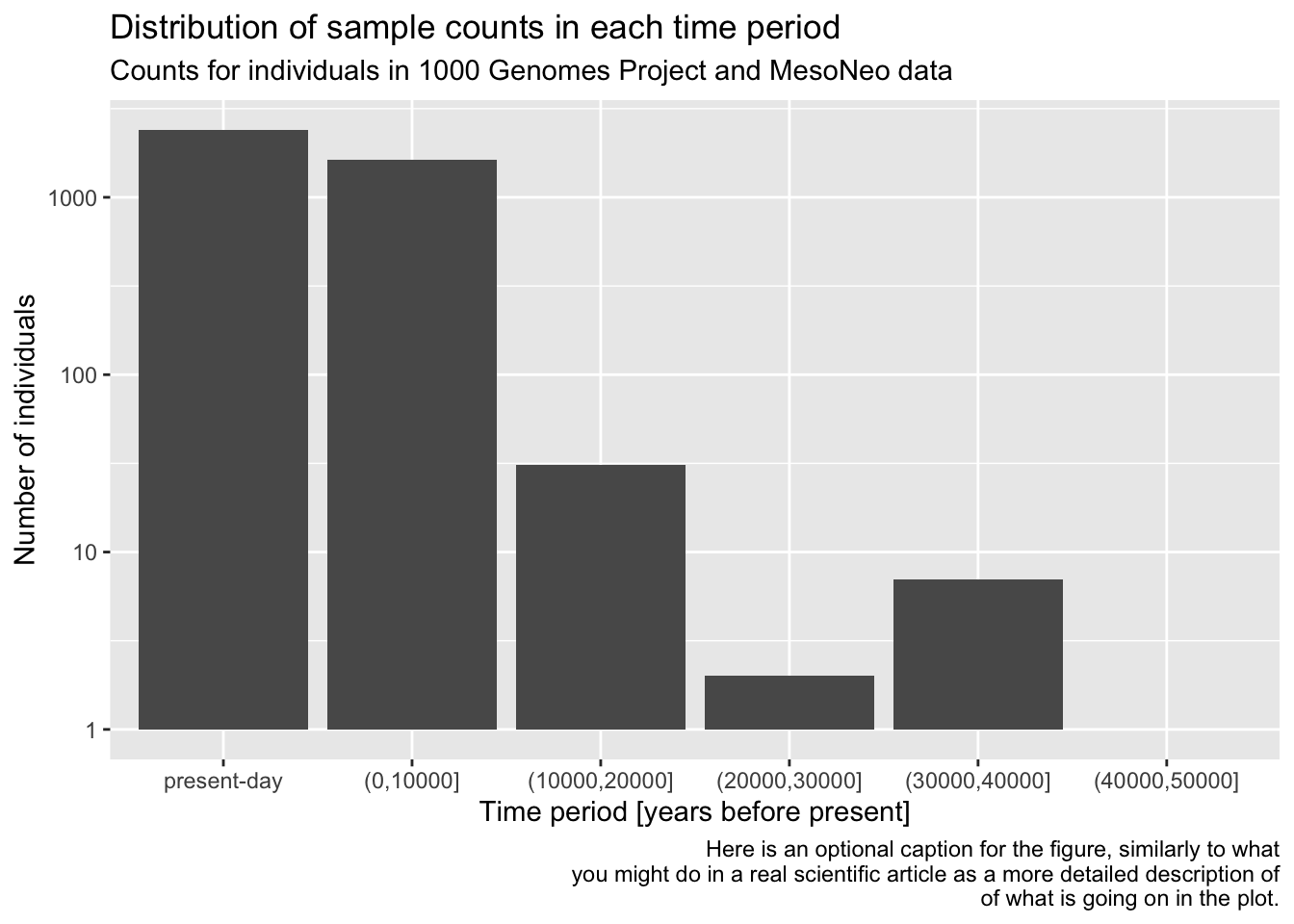
Does the order of adding layers with the + operator matter? Do a little experiment to figure it out by switching the order of the plotting commands and then running each version in your R console!
It’s useful to keep in mind that you can always pipe a data frame into a ggplot() function using the %>% operator. After all, %>% always places the “data frame from the left” as the first argument in the ggplot() call, where the function expects it anyway. I.e., instead of writing ggplot(metadata, aes(...)), you can also do metadata %>% ggplot(aes(...)). This allows you to transform or summarize data before plotting, which makes the combination of tidyverse and ggplot2 infinitely stronger.
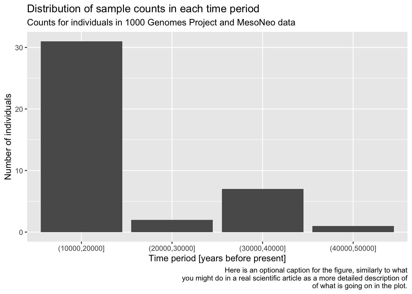
As a refresher and for a bit more practice, filter() the metadata first for individuals who are 10000 years or older, discarding the rest. Then pipe this filter() result into your ggplot() code for the bar plot you have created previously, keeping the plotting part exactly the same (maybe leave out the log-scale in this version).
NoteClick to see the solution
metadata %>%
filter(age > 10000) %>%
ggplot(aes(x = age_bin)) +
  geom_bar() +
  labs(
    y = "Number of individuals",
    x = "Time period [years before present]",
    title = "Distribution of sample counts in each time period",
    subtitle = "Counts for individuals in 1000 Genomes Project and MesoNeo data",
    caption = "Here is an optional caption for the figure, similarly to what
      you might do in a real scientific article as a more detailed description of
      of what is going on in the plot."
  )
Exercise 3: Distribution of a numerical variable
In the previous exercise you visualized a distribution of a categorical variable, specifically the counts of samples in an age_bin category. Now let’s look at continuous variables and this time consider not the metadata table, but our ibd_merged table of IBD segments between pairs of individuals. Here it is again, as a refresher:
head(ibd_merged)# A tibble: 6 × 18
sample1 sample2 country_pair region_pair time_pair chrom start end rel
<chr> <chr> <chr> <chr> <chr> <dbl> <dbl> <dbl> <chr>
1 VK548 NA20502 Norway:Italy Europe:Europe (0,10000… 21 58.3 62.1 none
2 VK528 HG01527 Norway:Spain Europe:Europe (0,10000… 21 24.8 27.9 none
3 PL_N28 NEO36 Poland:Sweden Europe:Europe (0,10000… 21 14.0 16.5 none
4 NEO556 HG02230 Russia:Spain Europe:Europe (0,10000… 21 13.1 14.0 none
5 HG02399 HG04062 China:India Asia:Asia present-… 21 18.8 21.0 none
6 EKA1 NEO220 Estonia:Sweden Europe:Europe (0,10000… 21 30.1 35.8 none
# ℹ 9 more variables: length <dbl>, country1 <chr>, continent1 <chr>,
# age1 <dbl>, age_bin1 <fct>, country2 <chr>, continent2 <chr>, age2 <dbl>,
# age_bin2 <fct>The most interesting quantity we might want to analyse in the IBD context is the length of IBD segments, which correlates with how recently did two individuals share a most recent common ancestor (and, therefore, their genetic relatedness). So let’s take a look at the distribution of IBD lengths across our data set as an opportunity to introduce new functionality and useful tricks of ggplot2.
geom_histogram() and geom_density()
You can visualize a distribution of values using the functions geom_histogram() and geom_density(). Both are useful for similar things, each has its strengths and weaknesses from a visualization perspective.
Visualize the distribution of length values across all individuals in your IBD data set, starting with these two general patterns, just like you did in the previous geom_bar() example:
ggplot() + geom_histogram(), and alsoggplot() + geom_density().
Of course, you have to specify ibd_merged as the first parameter of ggplot(), and fill in the aes(x = length) accordingly. Try to use the knowledge you obtained in the previous exercise! As a reminder, the length is expressed in units of centimorgans, so immediately add an x-axis label clarifying these units to anyone looking at your figure, either using xlab() or labs(x = ...).
NoteClick to see the solution
Here’s a histogram:
ibd_merged %>%
  ggplot(aes(x = length)) +
  geom_histogram() +
  labs(x = "IBD length [centimorgans]")
`stat_bin()` using `bins = 30`. Pick better value `binwidth`.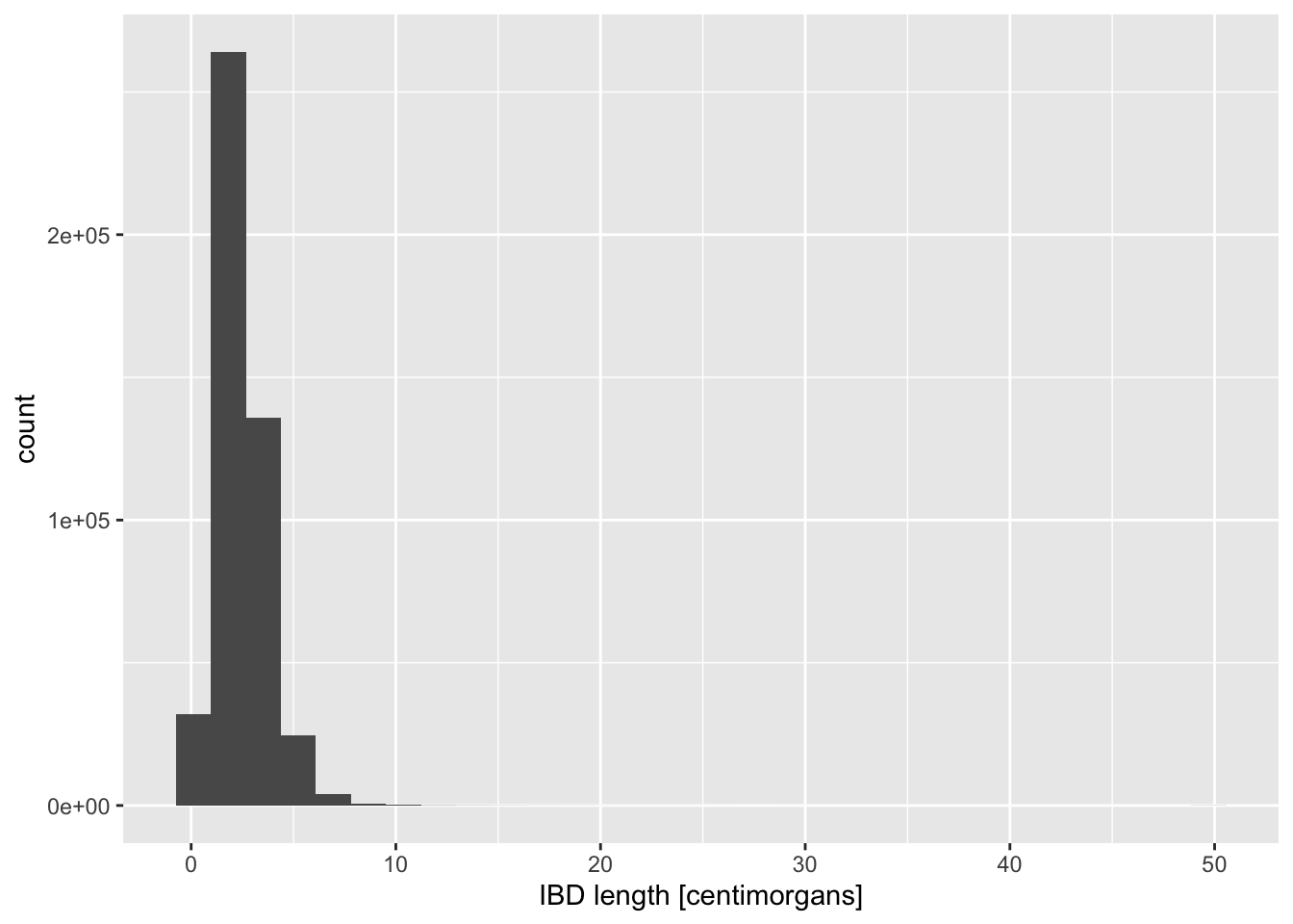
Here’s a density plot:
ibd_merged %>%
  ggplot(aes(x = length)) +
  geom_density() +
  labs(x = "IBD length [centimorgans]")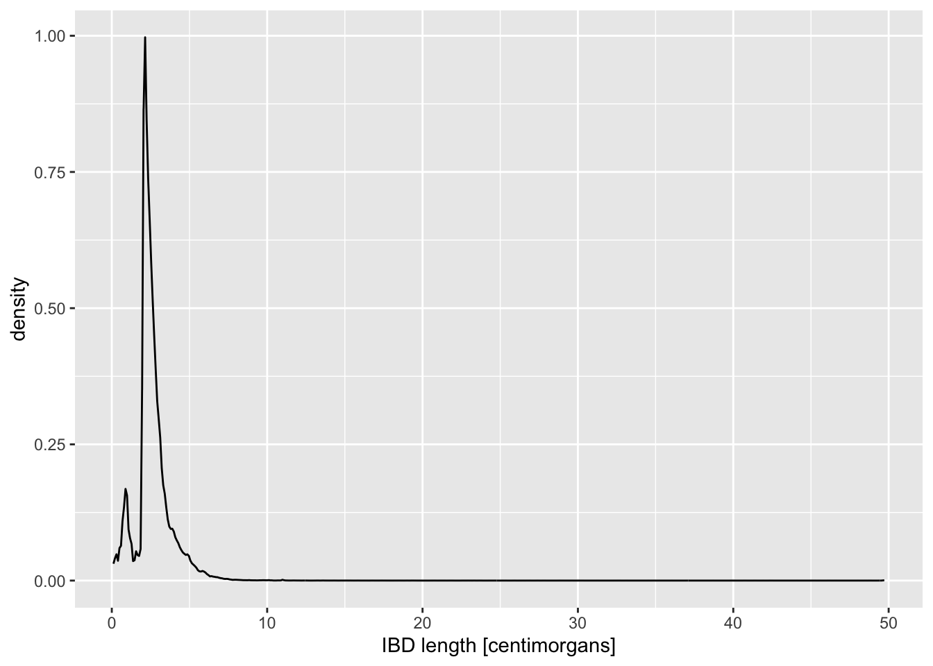
To make our data exploration a little easier at the beginning, let’s create a new variable ibd_eur from the total ibd_merged table as its subset, using the following tidyverse transformations (both of them):
filter()forregion_pair == "Europe:Europe"filter()fortime_pair == "present-day:present-day"
Save the result of both filtering steps as ibd_eur, and feel free to use the %>% pipeline concept that you learned about previously.
Note: This filtering retains only IBD segments shared between individuals from present-day Europe.
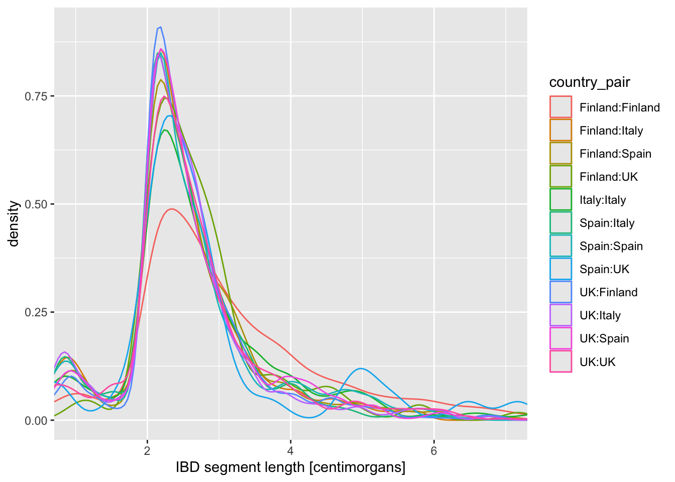
Now visualize the distribution of lengths in the reduced, Europe-only IBD data set stored in the ibd_eur variable. Do this in two versions again, using geom_histogram() or geom_density(), exactly like you did above. Additionally, for each of the two functions specify either fill or color (or both of them—experiment!) based on the variable country_pair. Experiment with the looks of the result and find your favourite (prettiest, cleanest, easiest to interpret, etc.).
Note: Think about how powerful the ggplot2 framework is. You only need to change one little thing (like swapping geom_histogram() for geom_density()) and keep everything else the same, and you get a completely new figure! This is amazing for brainstorming figures for papers, talks, etc.
How do you compare these different approaches based on the visuals of the graphics they produce (readability, aesthetics, scientific usefulness, etc.)? When does one seems more appropriate than other?
NoteClick to see the solution
- Histogram version with
fill = country_pairset (I personally don’t find thecolorversion of histograms useful at all so I’m not showing it here):
ibd_eur %>%
  ggplot(aes(x = length, fill = country_pair)) +
  geom_histogram() +
  labs(x = "IBD segment length [centimorgans]")
`stat_bin()` using `bins = 30`. Pick better value `binwidth`.
- Density versions:
- using
color = country_paironly:
ibd_eur %>%
  ggplot(aes(x = length, color = country_pair)) +
  geom_density() +
  labs(x = "IBD segment length [centimorgans]")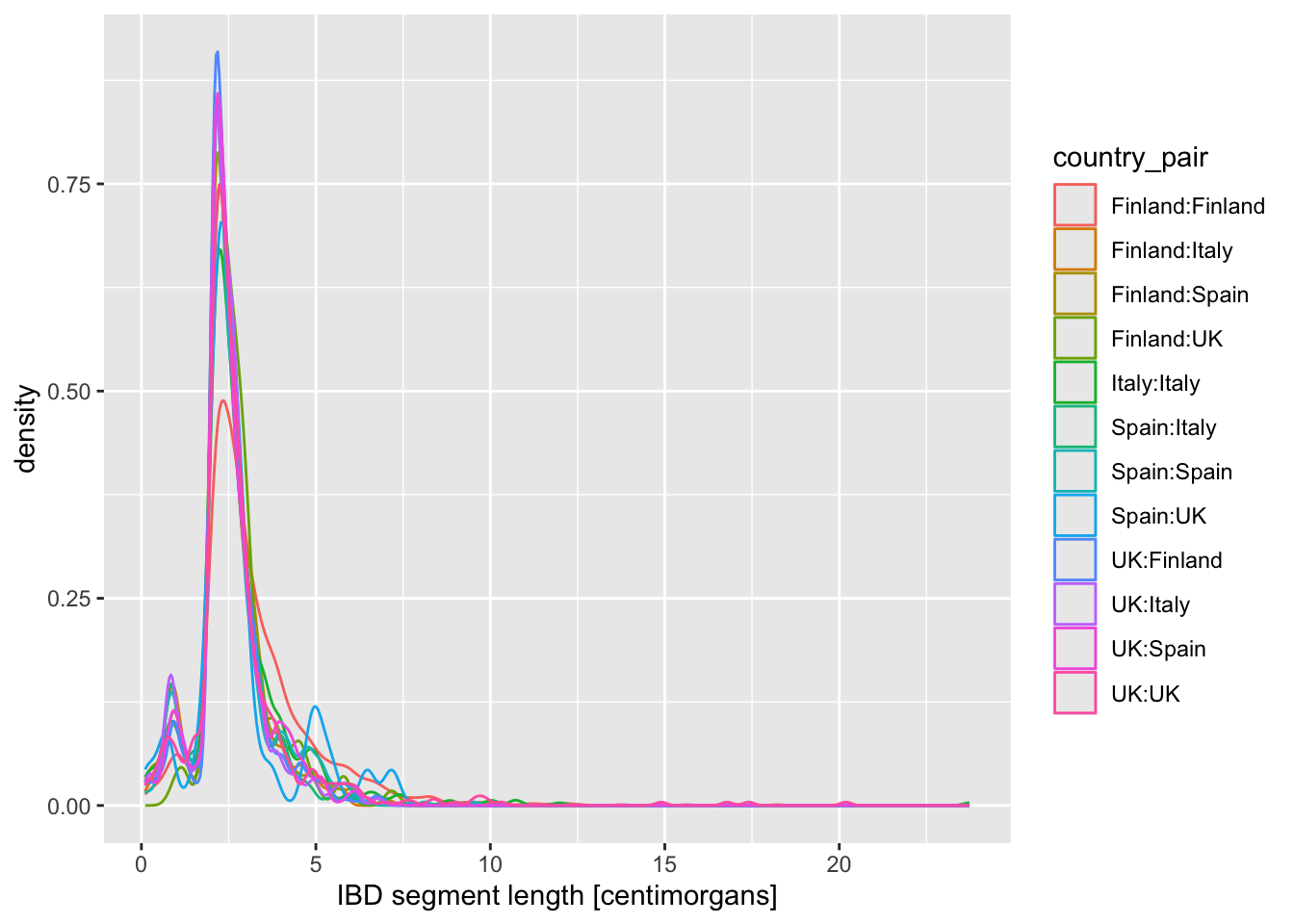
- using both
fillandcolor:
ibd_eur %>%
  ggplot(aes(x = length, fill = country_pair, color = country_pair)) +
  geom_density() +
  labs(x = "IBD segment length [centimorgans]")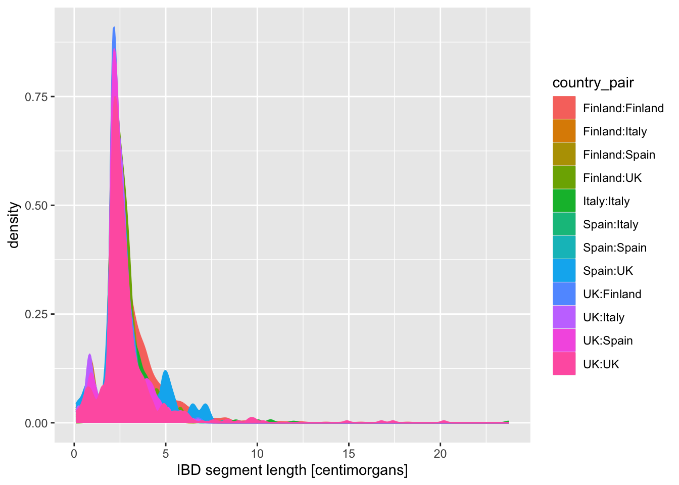
When you created a density plot while setting the fill = country_pair aesthetic, you got overlapping densities which are hard to disentangle. Does changing geom_density() for geom_density(alpha = 0.25) help a bit? What does alpha do?
NoteClick to see the solution
alpha sets the transparency value to avoid geoms hiding behind each other, but it doesn’t help that much here. It’s a useful parameter to keep in mind though!
ibd_eur %>%
  ggplot(aes(x = length, fill = country_pair, color = country_pair)) +
  geom_density(alpha = 0.5) +
  labs(x = "IBD segment length [centimorgans]")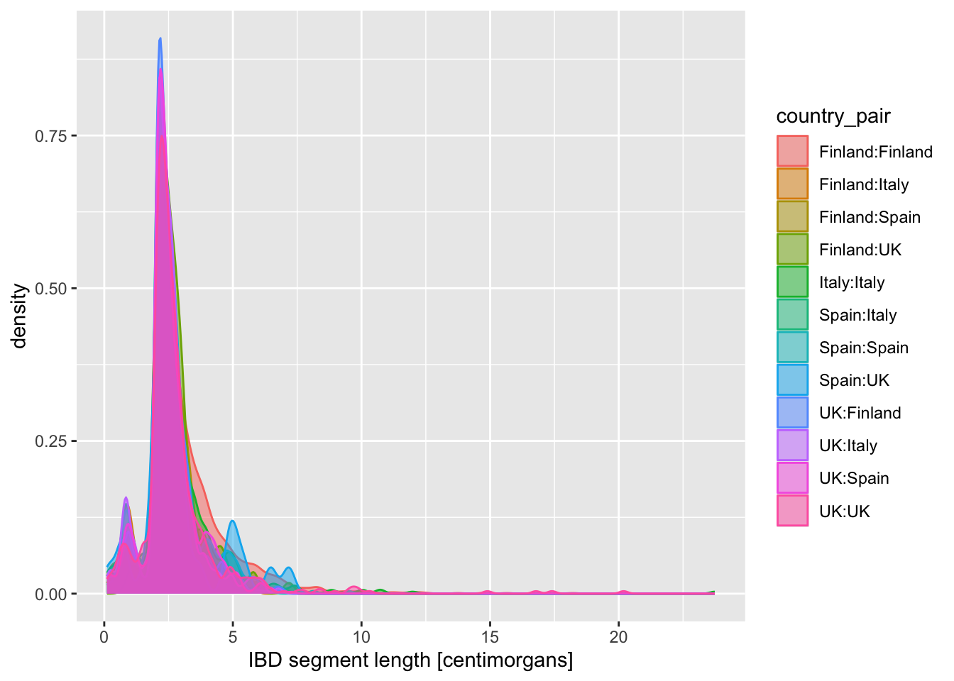
Exercise 4: Categories in facets (panels)
Let’s talk a little bit more about multiple dimensions of data (i.e., the number of columns in our data frames) and how we can represent them. This topic boils down to the question of “How many variables of our data can we capture in a single figure and have it still be as comprehensible as possible?” which is more and more important the more complex (and interesting!) our questions become.
Looking at the figures of IBD length distributions again (both histograms and densities), it’s clear there’s a lot of overlapping information that is a little hard to interpret. Just look at it again:
Code
ibd_eur %>%
  ggplot(aes(x = length, fill = country_pair)) +
  geom_histogram() +
  labs(x = "IBD segment length [centimorgans]")
`stat_bin()` using `bins = 30`. Pick better value `binwidth`.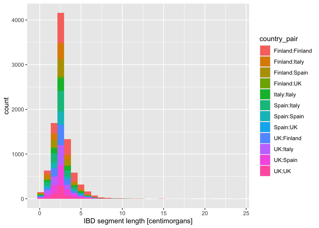
In situations like this, facetting can be very helpful.
Faceting is easier to demonstrate than explain, so just go ahead, take the code which created the IBD segment length histogram plot above (you can get it also by clicking on “⏵ Code” right above) and add yet another layer with + facet_wrap(~ country_pair) at the end of the plotting command. How do you interpret the result now? Is it easier to read?
NoteClick to see the solution
I think it definitely is! “Unwrapping” crowded plots in tidy individual panels is one of my favourite ggplot2 features.
ibd_eur %>%
  ggplot(aes(x = length, fill = country_pair)) +
  geom_histogram() +
  labs(x = "IBD segment length [centimorgans]") +
  facet_wrap(~ country_pair)
`stat_bin()` using `bins = 30`. Pick better value `binwidth`.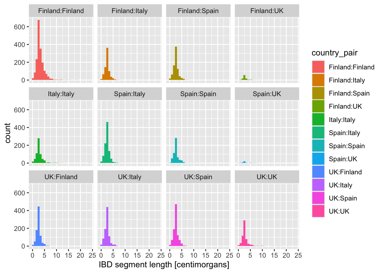
What happens when you add these variations of the facet_wrap() layer instead? When would you use one or the other?
+ facet_wrap(~ country_pair)+ facet_wrap(~ country_pair, scales = "free_x")+ facet_wrap(~ country_pair, scales = "free_y")+ facet_wrap(~ country_pair, scales = "free")
NoteClick to see the solution
I’ll use this opportunity to show you a useful trick of storing a ggplot2 result in a variable… because we can add to contents of variables using the + operator thanks to the magic provided by ggplot2!
We can create our “base histogram” like this, storing it in the variable p_histogram—try it yourself, please!
p_histogram <- ggplot(ibd_eur, aes(length, fill = country_pair)) +
  geom_histogram() +
  labs(x = "IBD segment length [centimorgans]")
This is our base histogram (very hard to read)
When you type out the variable in your R console, you get the figure back:
p_histogram`stat_bin()` using `bins = 30`. Pick better value `binwidth`.
And now you can add facet commands to this variable! Magic.
1. option
p_histogram + facet_wrap(~ country_pair)`stat_bin()` using `bins = 30`. Pick better value `binwidth`.
And here is what you get with various facet_wrap() options:
2. option – each facet has its own x-axis scale
p_histogram + facet_wrap(~ country_pair, scales = "free_x")`stat_bin()` using `bins = 30`. Pick better value `binwidth`.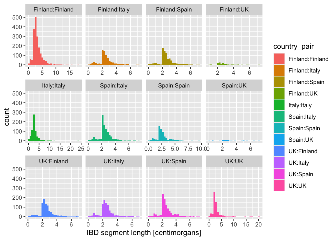
3. option – each facet has its own y-axis scale
p_histogram + facet_wrap(~ country_pair, scales = "free_y")`stat_bin()` using `bins = 30`. Pick better value `binwidth`.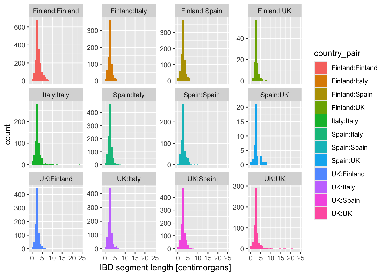
4. option – each facets has its own x- and y-axis scales
p_histogram + facet_wrap(~ country_pair, scales = "free")`stat_bin()` using `bins = 30`. Pick better value `binwidth`.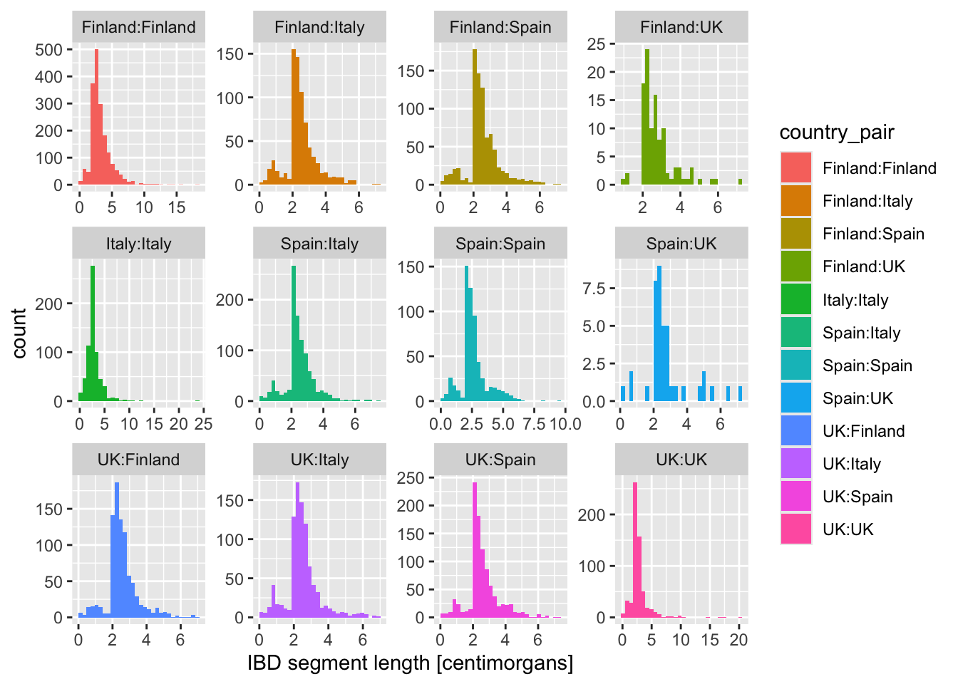
All approaches have their benefits. In general, personally, I think that figures which show the same statistic across different categories should use the same scales on both x- and y-axes, because this makes each facet comparable to each other.
But there are pros and cons to doing all of these in different situations!
Exercise 5: Limiting axis scales
Sometimes when visualizing distributions of numerical variables (histograms, densities, any other geom we’ll see later), the distribution is too widely spread out to be useful. We can mitigate this using these two additional new layers which restrict the range of the x-axis of our figures:
+ xlim(1, 7)+ coord_cartesian(xlim = c(1, 7))
Take your density distribution ggplot of lengths of IBD segments again (you can use my code right below) and add 1. or 2. option above. What’s the difference between both possibilities?
ibd_eur %>%
    ggplot(aes(x = length, color = country_pair)) +
    geom_density() +
    labs(x = "IBD segment length [centimorgans]")
NoteClick to see the solution
Here are the two versions of restricting the x-axis scale. Note that they differ only by the command used at the 5th line!
coord_cartesian()performs so-called “soft clipping” – it restricts the “viewpoint” on the entire data set:
xlim()does “hard clipping” – it effectively removes the points outside of the given range. This usually isn’t what we want, so I personally rarely if ever use this:
Warning: Removed 653 rows containing non-finite outside the scale range
(`stat_density()`).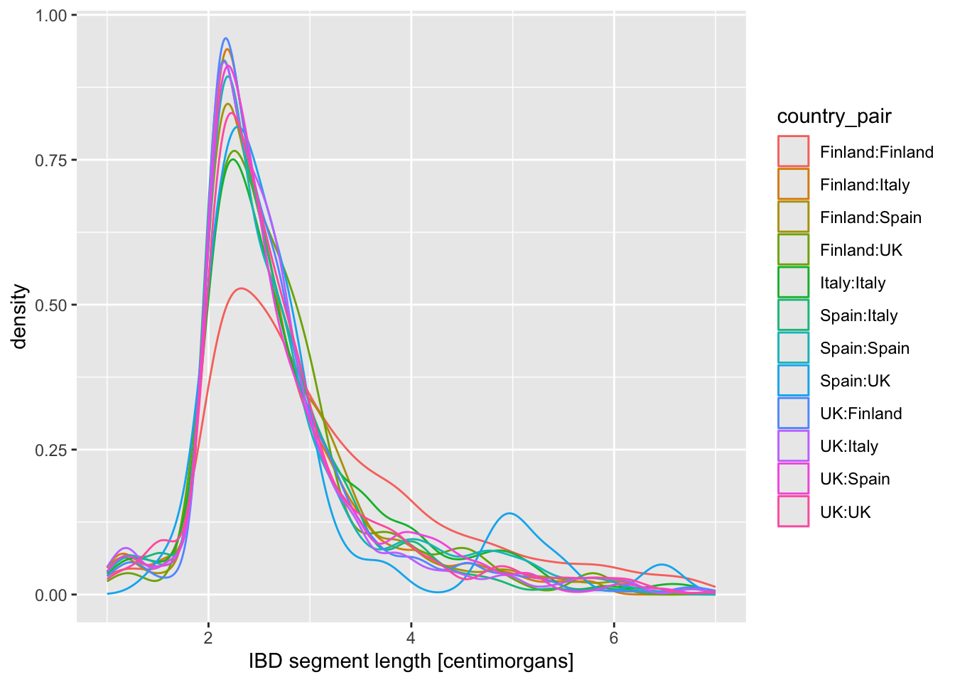
Admittedly they both give the same result in this situation, but that’s not always the case, so be careful! I personally usually use the option 1., just to be safe.
Is there evidence of some countries sharing more IBD sequence within themselves? If that’s the case, it could be a result of a stronger population bottleneck. The previous density plot is a little too busy to be able to see this, so filter your ibd_eur table for rows in which country1 == country2, and then %>% pipe it into the same ggplot2 density command you just used.
NoteClick to see the solution
ibd_eur %>%
  filter(country1 == country2) %>%
  ggplot(aes(length, color = country_pair)) +
  geom_density() +
  labs(x = "IBD segment length [centimorgans]") +
  xlim(0, 10)
Warning: Removed 23 rows containing non-finite outside the scale range
(`stat_density()`).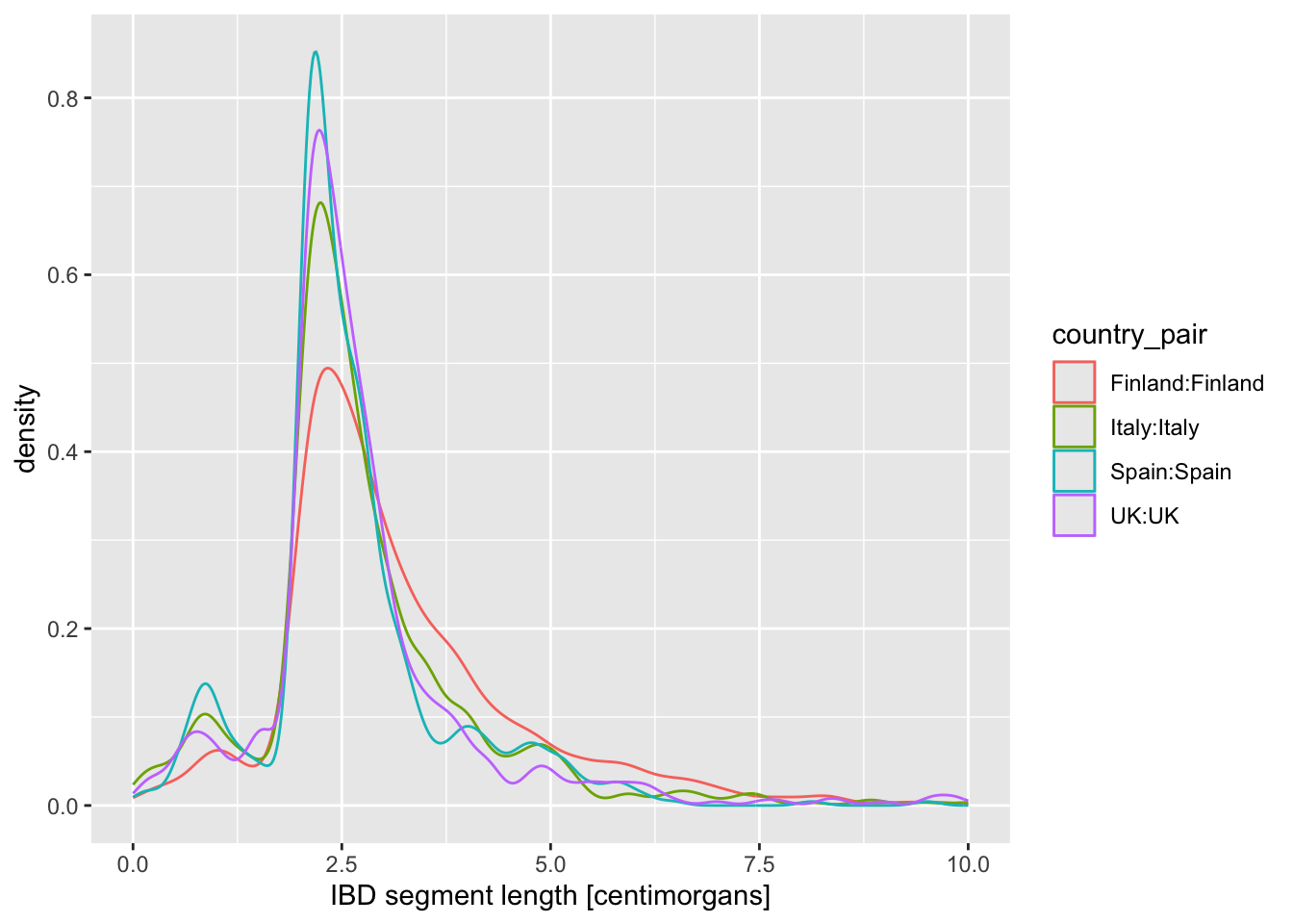
It looks like there might be more IBD sequence shared within Finland, which is consistent with a previously established hypothesis that ancestors of present-day Finns experienced a strong population bottleneck. For memory reasons, our example IBD segments data set only has information for chromosome 21, so we would need the full genome (ask me if you’re interested and I will take a look! I have the full data).
geom_boxplot() and geom_violin()
Let’s introduce another useful geom for visualization of this type of numerical data, the boxplot! You can visualize boxplots with the function geom_boxplot(), and calling (in our case right here) aes(x = country_pair, y = length, color = country_pair) within the ggplot() function. Adjust your previous density example according to these instructions to show boxplots instead!
Then, when you have your boxplots, swap out geom_boxplot() for geom_violin().
Note: Again, notice how super modular and customizable ggplot2 for making many different types of visualizations. We just had to swap one function for another.
NoteClick to see the solution
ibd_eur %>%
  filter(country1 == country2) %>%
  ggplot(aes(x = country_pair, y = length, color = country_pair)) +
  geom_boxplot() +
  labs(y = "IBD segment length [centimorgans]") +
  ylim(0, 10)
Warning: Removed 23 rows containing non-finite outside the scale range
(`stat_boxplot()`).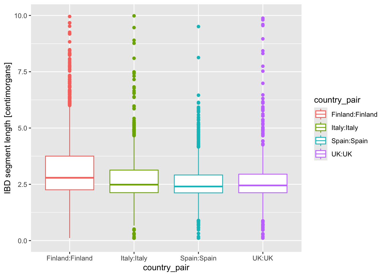
ibd_eur %>%
  filter(country1 == country2) %>%
  ggplot(aes(x = country_pair, y = length, color = country_pair)) +
  geom_violin() +
  labs(y = "IBD segment length [centimorgans]") +
  ylim(0, 10)
Warning: Removed 23 rows containing non-finite outside the scale range
(`stat_ydensity()`).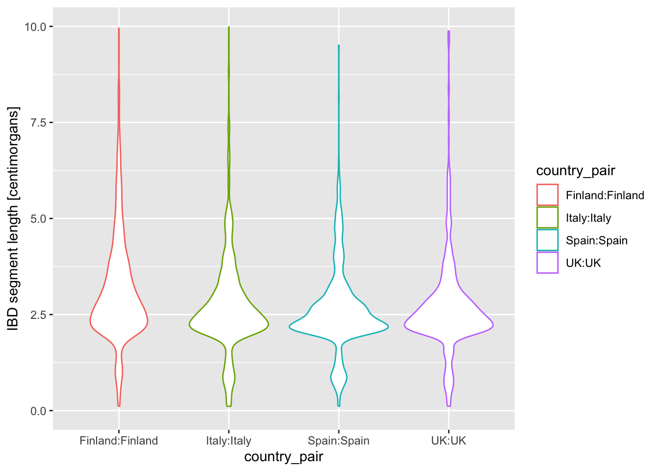
I’m personally a much bigger fan of the violin plot for this kind of purpose, because I feel like boxplot hides too much about the distribution of the data.
On that note, another useful trick we haven’t mentioned yet is that we can plot multiple geoms from the same data! You are already quite familiar with the ggplot2 concept of layering functions on top of each other using the + operator. What happens when you add + geom_jitter(size = 0.3, color = "darkgray") (again at the end of the code which produces violin, and keeping the geom_violin() command in there)? How do you read the resulting figure?
Note: We specified color = "darkgray", which effectively overrides the color = country_pair assigned “globally” in the ggplot() call (and which normally sets the color for every single geom we would add to our figure).
NoteClick to see the solution
geom_jitter() is extremely useful to really clearly see the true distribution of our data points (which is often otherwise hidden by the “summarizing geoms”, such as boxplot above — one reason why I’m not a fan of boxplots, as I mentioned!):
ibd_eur %>%
  filter(country1 == country2) %>%
  ggplot(aes(x = country_pair, y = length, color = country_pair)) +
  geom_violin() +
  geom_jitter(size = 0.3, color = "darkgray") +
  labs(y = "IBD segment length [centimorgans]") +
  ylim(0, 10)
Warning: Removed 23 rows containing non-finite outside the scale range
(`stat_ydensity()`).Warning: Removed 23 rows containing missing values or values outside the scale range
(`geom_point()`).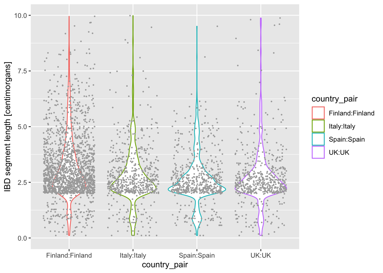
What do you think happens when you swap the order of geom_violin() and geom_jitter(...) in your previous solution? Why does the order matter? When you do swap them, next try a variation in which you write geom_violin(alpha = 0.25).
NoteClick to see the solution
ggplot2 arranges elements on a canvas literally like a painter would, if an element is added and another element is added later, the latter can (partially) overlap the former:
ibd_eur %>%
  filter(country1 == country2) %>%
  ggplot(aes(x = country_pair, y = length, color = country_pair)) +
  geom_jitter(size = 0.3, color = "darkgray") + # we flipped the order
  geom_violin() +                               # of these two geoms
  labs(y = "IBD segment length [centimorgans]") +
  ylim(0, 10)
Warning: Removed 23 rows containing non-finite outside the scale range
(`stat_ydensity()`).Warning: Removed 23 rows containing missing values or values outside the scale range
(`geom_point()`).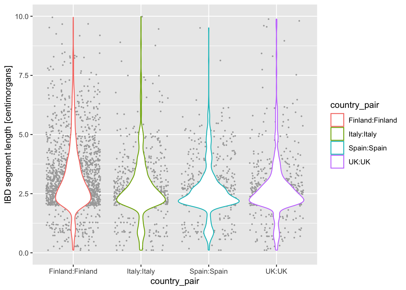
Of course, this can also be intentional sometimes! It all depends on the aesthetic you’re going for as a visualization artist. :)
Here’s the version which sets transparency of the violin geom to 0.25:
ibd_eur %>%
  filter(country1 == country2) %>%
  ggplot(aes(x = country_pair, y = length, color = country_pair)) +
  geom_jitter(size = 0.3, color = "darkgray") +
  geom_violin(alpha = 0.5) +
  labs(y = "IBD segment length [centimorgans]") +
  ylim(0, 10)
Warning: Removed 23 rows containing non-finite outside the scale range
(`stat_ydensity()`).Warning: Removed 23 rows containing missing values or values outside the scale range
(`geom_point()`).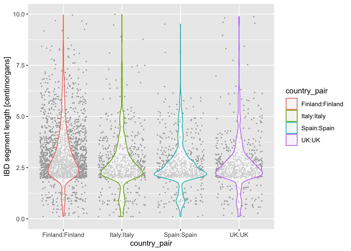
Intermezzo: Saving ggplot2 figures to PDF
Looking at figures in RStudio is useful for quick data exploration, but when we want to use a figure in a paper or a presentation, we need to save it to disk. Doing this is very easy using the function ggsave().
There are generally three options:
- Simply running a ggplot2 command, and calling
ggsave()right after to save a single figure. Something like this:
# we first plot a figure by running this in the R console:
ggplot(ibd_eur, aes(length, fill = country_pair)) +
  geom_histogram() +
  labs(x = "IBD segment length [centimorgans]")

# this then saves the last figure to a given file
ggsave("~/Desktop/ibd_length_histogram.pdf")- Or, sometimes in a larger script (like we’ll see later), it’s useful to actually save a ggplot to a variable (yes, you can do that!), and then give that variable to
ggsave()as its second parameter. This is useful when you want to first create multiple plots, store them in their own variables, then save them to files at once. Something like this:
# we first create a histogram plot
p_histogram <- ggplot(ibd_eur, aes(length, fill = country_pair)) +
  geom_histogram() +
  labs(x = "IBD segment length [centimorgans]")

# then we create a density plot
p_density <- ggplot(ibd_eur, aes(length, fill = country_pair)) +
  geom_density(alpha = 0.7) +
  labs(x = "IBD segment length [centimorgans]")

# we can save figures stored in variables like this
ggsave("~/Desktop/ibd_length_histogram.pdf", p_histogram)
ggsave("~/Desktop/ibd_length_density.pdf", p_density)- Save multiple figures into a single PDF. This requires a different approach, in which we first initialize a PDF file, then we have to print(!) individual variables with each ggplot2 figure, and then close that PDF file. Yes, this is confusing, but don’t worry about the technical details of it! Just take this as a recipe you can revisit later if you need to.
# this creates an empty PDF -- printing figures after this saves them to the PDF
pdf("~/Desktop/multiple_plots.pdf")

# we have to print(!) individual variables with each plot
print(p_histogram)
print(p_density)

# this closes the PDF
dev.off()
I don’t think it’s very interesting to create a specific exercise for it. Just try running these three examples on your own, and see what happens! We’ll be using these techniques a lot in the next session, so just keep them in mind for now.
Note: Take a peek at ?ggsave and ?pdf help pages to see customization options, particularly on the sizes of the PDFs. Also, how would you create a PNG images with the figures? Use the help pages!
Exercise 6: Relationship between two variables
geom_point()
We’ll now look at creating another type of visualization which is extremely useful and very common: a scatter plot!
But first, I created a new data set for you from the original IBD segments table. It contains, for a given pair of individuals in the data set, several summary statistics about their level of IBD sharing across the entire genome (not just chromosome 21).
Read this table using this command:
ibd_sum <- read_tsv("http://tinyurl.com/simgen-ibd-sum", show_col_types = FALSE)Specifically, you will now focus on three columns of this new table ibd_sum.
n_ibd— the total number of IBD segments between those two individualstotal_ibd— the total amount of genome in IBD between those two individualsrel— indicator of the relatedness between those two individuals
With our summarized table ibd_sum ready, we’re ready to create our scatter plot. When we worked with geom_histogram(), geom_density(), and geom_bar(), we only needed to do something like this:
df %>%
  ggplot(aes(x = COLUMN_NAME)) +
  geom_FUNCTION()
As a reminder from the boxplot and violin exercise, because scatter plot is two-dimensional, we have to specify not only the x but also the y in the aes() aesthetic mapping, like this:
df %>%
  ggplot(aes(x = COLUMN_NAME1, y = COLUMN_NAME2)) +
  geom_point()
And with that bit of information, I think you already know how to do this based on your knowledge of basic ggplot2 techniques introduced above!
Use the function geom_point() to visualize the scatter plot of x = total_ibd against y = n_ibd. We know that related individuals share a large amounts of IBD sequence between each other. As a reminder, the entire human genome spans about 3000 centimorgans. Can you guess from your figure which pairs of individuals (a point on your figure representing one such pair) could be potentially closely related?
Note: Don’t worry about this biological question too much, just take a guess by looking at your scatter plot. Below we’ll look at this question more closely.
NoteClick to see the solution
It looks like some pairs of individuals share almost their entire genome in IBD, around the whole 3 gigabases of sequence!
We’ll work on clarifying that below.
ibd_sum %>%
  ggplot(aes(x = total_ibd, y = n_ibd)) +
  geom_point()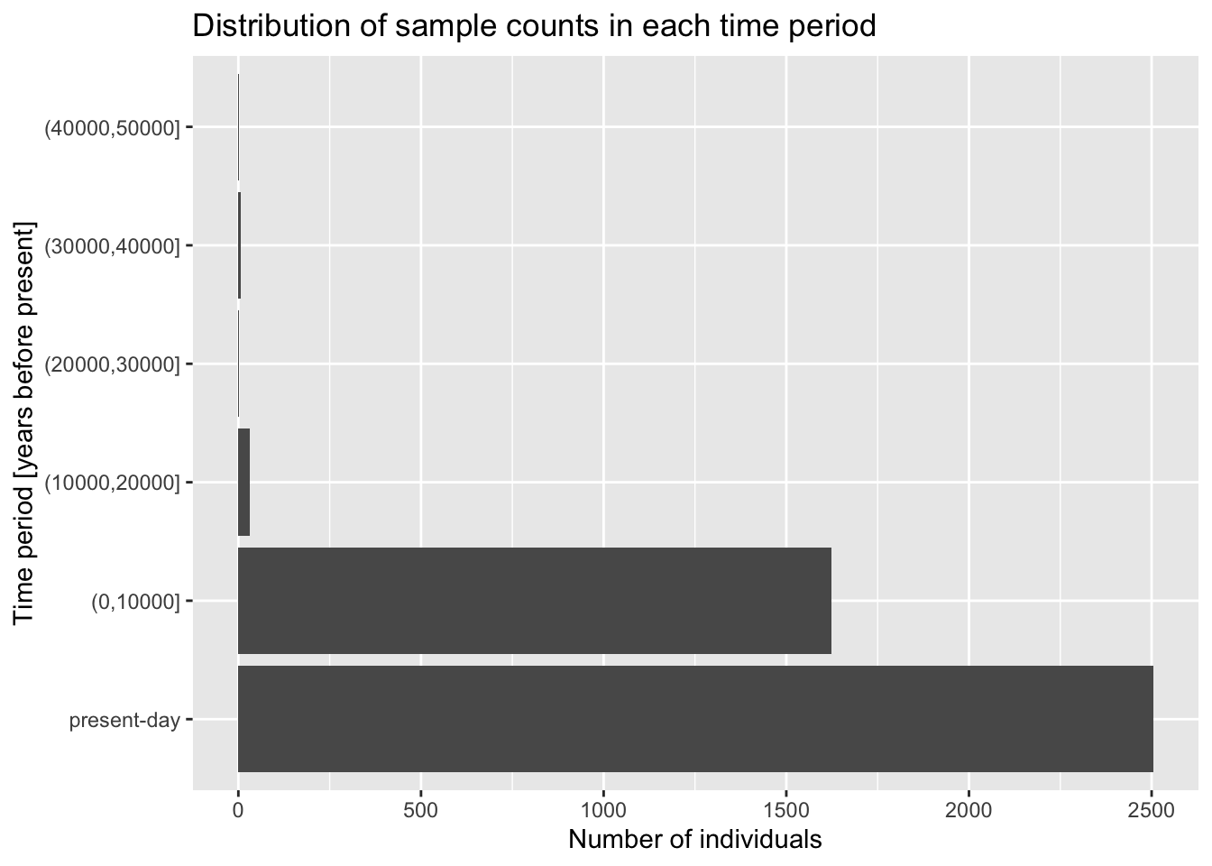
From the introduction of histograms and densities, you’re already familiar with modifying the aes() aesthetic of a geom layer using the color argument of aes(). Right now your dots are all black, which isn’t super informative. Luckily, your IBD table has a “mysterious” column called rel. What happens when you color points based on the values in this column inside the aes() function (i.e., set color = rel)?
Look at a figure from this huge study of IBD patterns and their relationship to the degree of relatedness between individuals? This is completely independent data set and independent analysis, but do you see similarities between this paper and your figure?
NoteClick to see the solution
ibd_sum %>%
  ggplot(aes(x = total_ibd, y = n_ibd, color = rel)) +
  geom_point()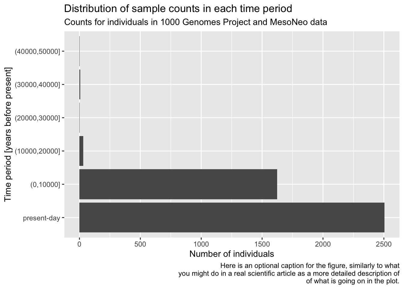
I have to say I kind of hate that “none” (basically a baseline background signal) is given a striking purple colour (and I love purple). I wouldn’t want that in my paper, and we will show a potential solution to this soon! For now, let’s keep going.
To get a bit closer to a presentation-ready figure, use the + labs() layer function to properly annotate your x and y axes, and give your figure a nice title too, based on your knowledge of what x and y axes are supposed to represent (see a description of those columns above).
NoteClick to see the solution
ibd_sum %>%
  ggplot(aes(x = total_ibd, y = n_ibd, color = rel)) +
  geom_point() +
  labs(x = "total IBD sequence", y = "number of IBD segments",
       title = "Total IBD sequence vs number of IBD segments",
       subtitle = "Both quantities computed only on IBD segments 10 cM or longer")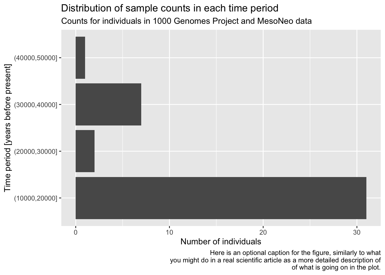
TODO: Setting custom color scales
NoteClick to see the solution
ibd_unrel <- filter(ibd_sum, rel == "none")
ibd_rel <- filter(ibd_sum, rel != "none")

ggplot() +
  geom_point(data = ibd_unrel, aes(x = total_ibd, y = n_ibd), color = "lightgray", size = 0.75) +
  geom_point(data = ibd_rel, aes(x = total_ibd, y = n_ibd, color = rel, shape = rel)) +
  labs(
    x = "total IBD sequence",
    y = "number of IBD segments",
    title = "Total IBD sequence vs number of IBD segments",
    subtitle = "Both quantities computed only on IBD segments 10 cM or longer"
  ) +
  guides(color = guide_legend(title = "relatedness"),
         shape = guide_legend(title = "relatedness")) +
  scale_color_manual(values = c("duplicate" = "red",
                                "1st degree" = "darkgreen",
                                "2nd degree" = "blue")) +
  theme_minimal()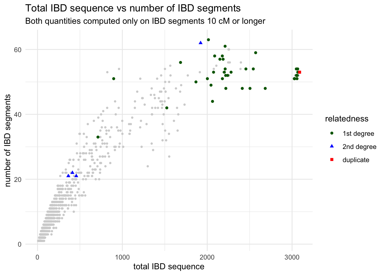
TODO: Ordering categories
NoteClick to see the solution
ibd_sum$relatedness <- factor(
  ibd_sum$rel,
  levels = c("duplicate", "1st degree", "2nd degree", "none")
)

ggplot() +
  geom_point(data = ibd_sum, aes(x = total_ibd, y = n_ibd, color = relatedness, shape = relatedness), size = 0.75) +
  labs(
    x = "total IBD sequence",
    y = "number of IBD segments",
    title = "Total IBD sequence vs number of IBD segments",
    subtitle = "Both quantities computed only on IBD segments 10 cM or longer"
  ) +
  theme_minimal() +
  scale_color_manual(values = c("duplicate" = "red",
                                "1st degree" = "darkgreen",
                                "2nd degree" = "blue",
                                "none" = "lightgray"))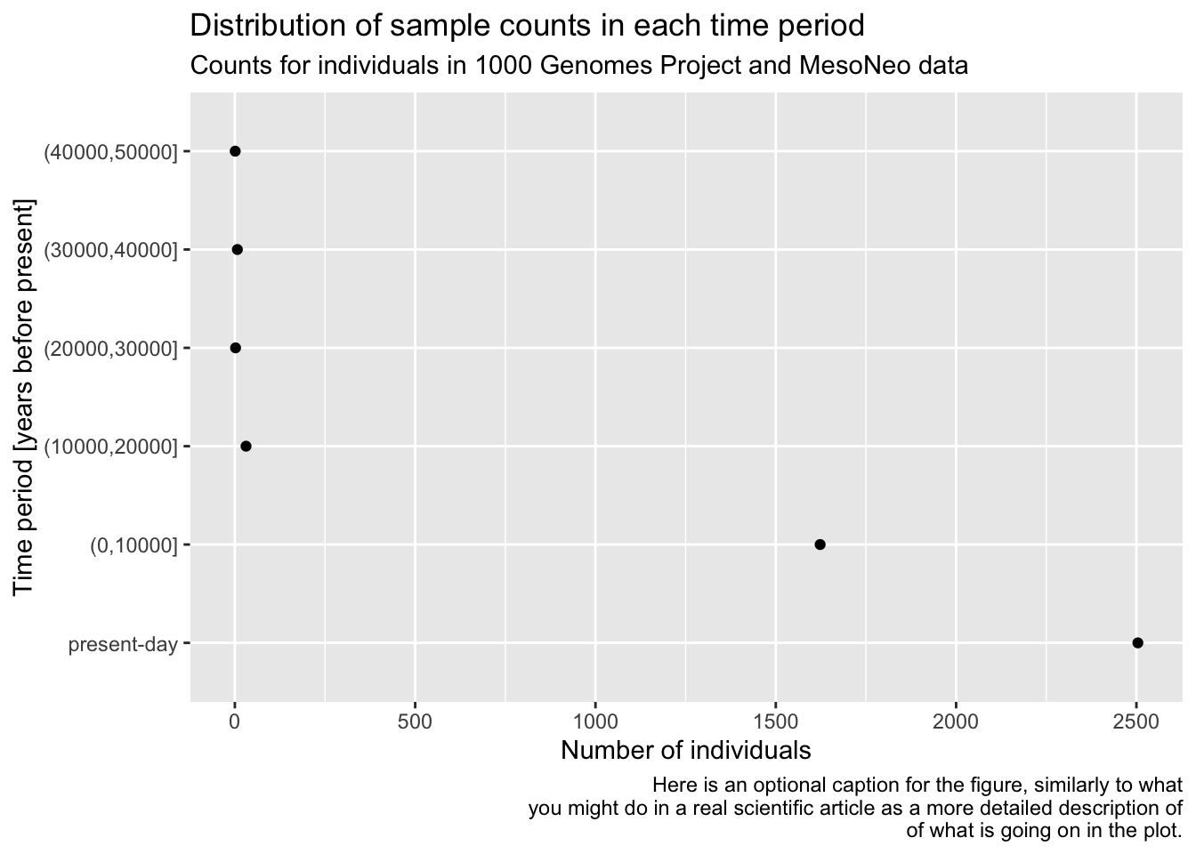
TODO: Rotating x-axis labels or coord_flip()
Exercise 7: Multiple data sets in one plot
So far we’ve always followed this pattern of ggplot2 usage, to borrow our very first geom_histogram() example just for the sake of explanation:
ggplot(ibd_segments, aes(length)) +
  geom_histogram()
`stat_bin()` using `bins = 30`. Pick better value `binwidth`.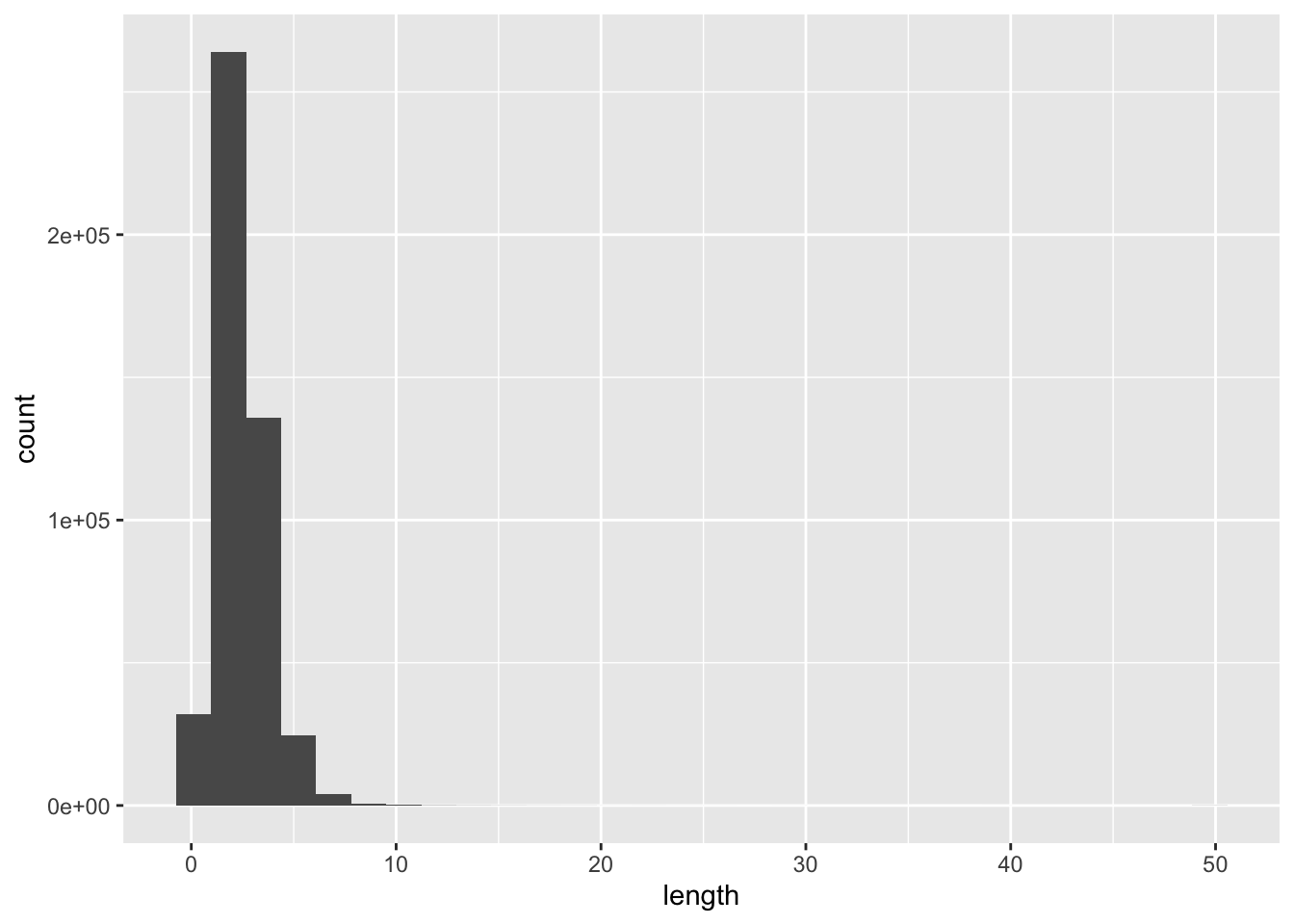
However, you can also do this and it will give the same result (try it— it will come in handy many times in the future!). Take a close look at this chunk of code and compare it with the previous chunk of code.
ggplot() +
  geom_histogram(data = ibd_segments, aes(length))
`stat_bin()` using `bins = 30`. Pick better value `binwidth`.
In other words, each geom_<...>() function accepts both data data frame and also its own aes() aesthetic and mapping function. You could think of this as each individual geom having a “self-contained” ggplot() function’s ability.
This can be very useful whenever you want to plot different geoms with their own aesthetic parameters (colors, shapes, sizes)! Let’s work through an exercise to explain this better, step by step, to make our IBD scatter plot figure much more nicer to look at.
Above I complained a little bit how the “none” related data points are given just as strikingly colorful points as data points of interest. What we want to establish is different visual treatments of different kinds of data. Here’s one solution to do this (which will also demonstrate a very very useful ggplot2 trick).
First, take your ibd_sum table and create two versions of it using filter() like this:
ibd_unrel <- filter(ibd_sum, rel == "none")ibd_rel <- filter(ibd_sum, rel != "none")
The first table contains only those pairs of individuals with missing information about relatedness, the second one contains only those rows with this information present.
Now visualize the ibd_unrel (i.e., IBD summaries between unrelated individuals) table with the following code:
ggplot() +
  geom_point(data = ibd_unrel, aes(x = total_ibd, y = n_ibd), color = "lightgray", size = 0.75)
Note: The ggplot() in this case has no arguments, just like we showed in the two versions of geom_histogram() above. Everything is in the geom_point() call!
NoteClick to see the solution
ggplot() +
  geom_point(data = ibd_unrel, aes(x = total_ibd, y = n_ibd), color = "lightgray", size = 0.75)
Now visualize the scatter plot of pairs of individuals which are known to be related, ibd_rel:
ggplot() +
  geom_point(data = ibd_rel, aes(x = total_ibd, y = n_ibd, color = rel))
NoteClick to see the solution
ggplot() +
  geom_point(data = ibd_rel, aes(x = total_ibd, y = n_ibd, color = rel))
Compare the two figures you just created, based on ibd_rel and ibd_unrel to the complete figure based on ibd_sum you created above (the one with purple “none” points that I didn’t like). You can see that these to plots together are showing the same data.
You have now plotted the two scatter plots separately, but here comes a very cool aspect of ggplot2 I wanted to show you. You can combine the two figures, each plotting a different data frame, into one figure by writing ggplot2 code which has both geom_point() calls for ibd_unrel and ibd_rel in the same command. To put it more simply, you can have multiple “geoms” in the same plot.
Do this now and to make the figure even nicer (and even publication ready!), add proper x and y labels, overall plot title as well as subtitle (all using the labs() layer functions) as well as adjust the legend title (just like you did with the guides() layer function above).
Hint: If it still isn’t clear, don’t worry. Here’s a bit of help of what your plotting code should look like:
ggplot() +
  geom_point(<YOUR CODE PLOTTING UNRELATED IBD PAIRS>) +
  geom_point(<YOUR CODE PLOTTING RELATED IBD PAIRS>) +
  labs(<x, y, title, and subtitle text>) +
  guides(color = guide_legend("relatedness"))
NoteClick to see the solution
Here’s the complete solution to this exercise:
ibd_unrel <- filter(ibd_sum, rel == "none")
ibd_rel <- filter(ibd_sum, rel != "none")

ggplot() +
  geom_point(data = ibd_unrel, aes(x = total_ibd, y = n_ibd), color = "lightgray", size = 0.75) +
  geom_point(data = ibd_rel, aes(x = total_ibd, y = n_ibd, color = rel)) +
  labs(
    x = "total IBD sequence",
    y = "number of IBD segments",
    title = "Total IBD sequence vs number of IBD segments",
    subtitle = "Both quantities computed only on IBD segments 10 cM or longer"
  ) +
  guides(color = guide_legend(title = "relatedness"))
As a bonus, and to learn another parameter of aes() useful for scatter plots, in addition to setting color = rel (which sets a color of each point based on the relatedness value), add also shape = rel. Observe what happens when you do this!
Finally, I’m not personally fan of the default grey-filled background of ggplots. I like to add + theme_minimal() at the end of my plotting code of many of my figures, particularly when I’m creating visualizations for my papers. Try it too!
NoteClick to see the solution
Here’s the complete solution to this exercise:
ibd_unrel <- filter(ibd_sum, rel == "none")
ibd_rel <- filter(ibd_sum, rel != "none")

ggplot() +
  geom_point(data = ibd_unrel, aes(x = total_ibd, y = n_ibd), color = "lightgray", size = 0.75) +
  geom_point(data = ibd_rel, aes(x = total_ibd, y = n_ibd, color = rel, shape = rel)) +
  labs(
    x = "total IBD sequence",
    y = "number of IBD segments",
    title = "Total IBD sequence vs number of IBD segments",
    subtitle = "Both quantities computed only on IBD segments 10 cM or longer"
  ) +
  guides(
    color = guide_legend(title = "relatedness"),
    shape = guide_legend(title = "relatedness")
  ) +
  theme_minimal()
Bonus Part 2: Practicing visualization on time-series data
Exercise 8: Getting fresh new new data
We’ve spent a lot of time looking at metadata and IBD data, demonstrating various useful bits of techniques from across tidyverse and ggplot2. There are many more useful things to learn, but let’s switch gears a little bit and look at a slightly different kind of data set, just to keep things interesting.
First, create a new script and save it as f4ratio.R.
Then add the following couple of lines of setup code, which again loads the necessary libraries and also reads a new example data set:
library(dplyr)
library(readr)
library(ggplot2)

f4ratio <- read_tsv("https://tinyurl.com/simgen-f4ratio", show_col_types = FALSE)
This data set contains results from a huge population genetics simulation study I recently did, and contains estimates of the proportion of Neanderthal ancestry in a set of European individuals spanning the past 50 thousand years.
Here’s a brief description of the contents of the columns:
individual,time– name and time (in years before present) of an individualstatistic– a variant of an estimator of Neanderthal ancestryproportion– the proportion of Neanderthal ancestry estimated bystatisticrate_eur2afr– the amount of ancient migration (gene flow) from Europe to Africa in a given scenarioreplicate– the replicate number of a simulation run (each scenario was run multiple times to capture the effect of stochasticity)
head(f4ratio)# A tibble: 6 × 6
individual time statistic proportion rate_eur2afr replicate
<chr> <dbl> <chr> <dbl> <dbl> <dbl>
1 eur_1 40000 direct f4-ratio 0.00687 0 1
2 eur_2 38000 direct f4-ratio 0.00807 0 1
3 eur_3 36000 direct f4-ratio 0.00192 0 1
4 eur_4 34000 direct f4-ratio 0.0245 0 1
5 eur_5 32000 direct f4-ratio 0.000390 0 1
6 eur_6 30000 direct f4-ratio -0.00267 0 1In other words, each row of this table contains the proportion of Neanderthal ancestry estimated for a given individual at a given time in some scenario specified by a given set of other parameters (rate_eur2afr, replicate).
In this exercise, I will be asking you some questions, the answers to which you should be able to arrive to by the set of techniques from tidyverse you’ve already learned, and visualize them using the ggplot2 functions you already know. When a new function will be needed, I will be dropping hints for you along the way!
This exercise is primarily intended for you to practice more ggplot2 visualization, because I think this is the most crucial skill in doing any kind of data analysis. Why? The faster you can get from an idea to a visualization of that idea, the faster you’ll be able to do research.
Let’s go!
Use geom_point() to plot the relationship between time (x axis) and proportion of Neanderthal ancestry (y axis). Don’t worry about any other variables just yet (colors, facet, etc.).
Note: The f4ratio table is too huge to plot every single point. Before you %>% pipe it into ggplot(), subsample the rows to just 10% of it subset using this trick:
f4ratio %>%
  sample_frac(0.1) %>% # subsample 10% fraction of the data
  ggplot(aes(...)) +
    geom_point()
Hint: Look at ?sample_frac but also ?sample_n and check out their parameters. They are incredible useful for any kind of data exploration!
NoteClick to see the solution
f4ratio %>%
sample_frac(0.1) %>%
ggplot(aes(time, proportion)) +
  geom_point()
Your plot now mashes together proportion values from two different statistic estimators. Fix this by facetting the plot, which will visualize both statistics in two separate panels. For the time being, keep doing the 10% subsampling step.
Hint: You can do this by adding + facet_wrap(~ statistic) to your previous code.
NoteClick to see the solution
f4ratio %>%
sample_frac(0.1) %>%
ggplot(aes(time, proportion)) +
  geom_point() +
  facet_wrap(~ statistic)
Take a look at the values on the x-axis of your figure. Purely for aesthetics, it is customary to visualize time going from oldest (left) to present-day (right). But, currently, the time direction is reversed. Fix this by adding a new layer with + scale_x_reverse()!
NoteClick to see the solution
f4ratio %>%
sample_frac(0.1) %>%
ggplot(aes(time, proportion)) +
  geom_point() +
  facet_wrap(~ statistic) +
  scale_x_reverse()
Whenever we visualize some biological statistics, we often want to compare their values to some kind of baseline (or a null hypothesis) value. In our case we have two:
- The baseline of “no Neanderthal ancestry” at y-axis value 0,
- The baseline of “known proportion of Neanderthal ancestry” today, which is about 3% (so y-axis value of 0.03).
Add those two baselines to your figure using a new function geom_hline() (standing for “horizontal line”). Like this:
<YOUR TIDYVERSE AND GGPLOT2 CODE ABOVE> +
  geom_hline(yintercept = 0.03, color = "red", linetype = "dashed") +
  geom_hline(yintercept = 0, color = "black", linetype = "dotted")
Note: You can immediately see the possibilities for adjusting the visuals like colors or linetype. Feel free to experiment with this!
NoteClick to see the solution
f4ratio %>%
sample_frac(0.1) %>%
ggplot(aes(time, proportion)) +
  geom_point() +
  facet_wrap(~ statistic) +
  scale_x_reverse() +
  geom_hline(yintercept = 0.03, color = "red", linetype = "dashed") +
  geom_hline(yintercept = 0, color = "blue", linetype = "dotted")
There’s clearly a huge amount of statistical noise, represented particularly in the “indirect f4-ratio” figure. And we’re not even plotting all points because there’s just too many of them!
Additionally, what I cared about in this particular case (during my PhD) were not values for each individual person (each represented by a single dot in the figure), but about the statistical trend in my data. An extremely important function for this is geom_smooth(), which fits a line through the data, capturing this trend.
In this next part, remove the subsampling done by sample_frac(), and also replace your geom_point() call in your figure code with this: + geom_smooth(se = FALSE). What happens when you run this modified version of your code? Read ?geom_smooth to figure out what se = FALSE means.
NoteClick to see the solution
f4ratio %>%
ggplot(aes(time, proportion)) +
  geom_smooth(se = FALSE) +
  facet_wrap(~ statistic) +
  scale_x_reverse() +
  geom_hline(yintercept = 0.03, color = "red", linetype = "dashed") +
  geom_hline(yintercept = 0, color = "blue", linetype = "dotted")
`geom_smooth()` using method = 'gam' and formula = 'y ~ s(x, bs = "cs")'
Well, we removed a lot of noise but we also removed most of the interesting signal! This is because we are now basically “smoothing” (averaging) over a very important variable: the amount of migration from Europe to Africa (which was the primary research interest for me at the time). Let’s take a look at our table again:
head(f4ratio)# A tibble: 6 × 6
individual time statistic proportion rate_eur2afr replicate
<chr> <dbl> <chr> <dbl> <dbl> <dbl>
1 eur_1 40000 direct f4-ratio 0.00687 0 1
2 eur_2 38000 direct f4-ratio 0.00807 0 1
3 eur_3 36000 direct f4-ratio 0.00192 0 1
4 eur_4 34000 direct f4-ratio 0.0245 0 1
5 eur_5 32000 direct f4-ratio 0.000390 0 1
6 eur_6 30000 direct f4-ratio -0.00267 0 1What we want is to plot not just a single line across every single scenario, but we want to plot one line for each value of our variable of interest, rate_eur2afr.
Let’s add the variable into play by adding color = rate_eur2afr into your aes() call in the ggplot() function so that it looks like this: ggplot(aes(time, proportion, color = rate_eur2afr))
Note: You’ll get a warning which we will fix in the next step, don’t worry!
NoteClick to see the solution
f4ratio %>%
ggplot(aes(time, proportion, color = rate_eur2afr)) +
  geom_smooth(se = FALSE) +
  facet_wrap(~ statistic) +
  scale_x_reverse() +
  geom_hline(yintercept = 0.03, color = "red", linetype = "dashed") +
  geom_hline(yintercept = 0, color = "blue", linetype = "dotted")
`geom_smooth()` using method = 'gam' and formula = 'y ~ s(x, bs = "cs")'Warning: The following aesthetics were dropped during statistical transformation:
colour.
ℹ This can happen when ggplot fails to infer the correct grouping structure in
the data.
ℹ Did you forget to specify a `group` aesthetic or to convert a numerical
variable into a factor?
The following aesthetics were dropped during statistical transformation:
colour.
ℹ This can happen when ggplot fails to infer the correct grouping structure in
the data.
ℹ Did you forget to specify a `group` aesthetic or to convert a numerical
variable into a factor?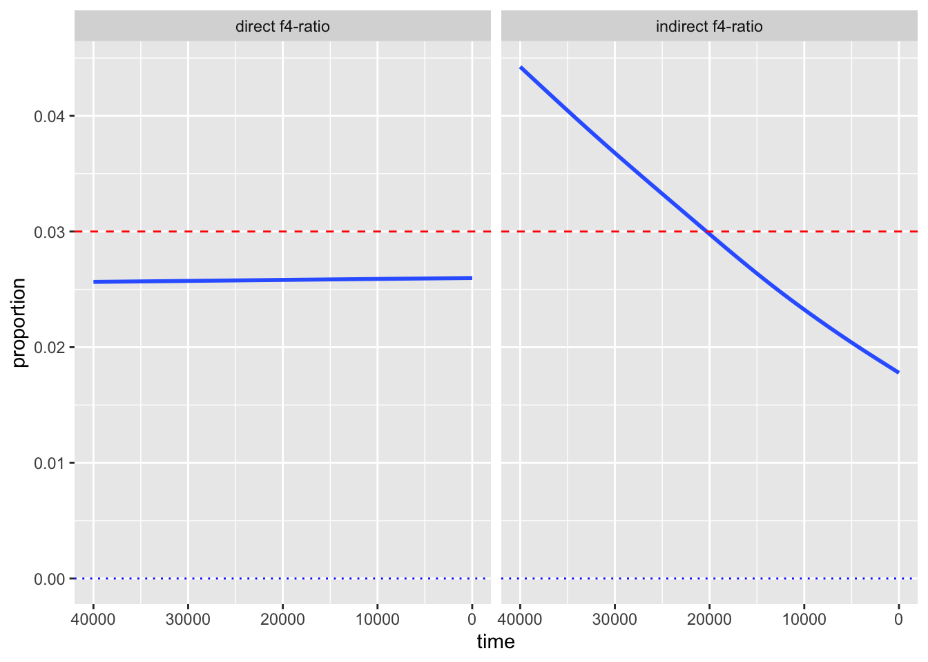
Don’t worry about the warning, we’ll fix this soon!
The reason we got a warning here is a slightly confusing behavior of the smoothing function geom_smooth(). Because rate_eur2afr is a numerical variable, the smoothing function cannot plot a single smoothed line for each of its values, because there could be (theoreticaly) an infinite number of them.
Fix the problem by adding group = rate_eur2afr right after the color = rate_eur2afr aesthetic mapping which you added in the previous exercise. This explicitly instructs geom_smooth() to treat individual values of rate_eur2afr as discrete categories.
NoteClick to see the solution
f4ratio %>%
ggplot(aes(time, proportion, color = rate_eur2afr, group = rate_eur2afr)) +
  geom_smooth(se = FALSE) +
  facet_wrap(~ statistic) +
  scale_x_reverse() +
  geom_hline(yintercept = 0.03, color = "red", linetype = "dashed") +
  geom_hline(yintercept = 0, color = "blue", linetype = "dotted")
`geom_smooth()` using method = 'gam' and formula = 'y ~ s(x, bs = "cs")'
Let’s finalize our figure for publication! Use labs() to add proper x, y, and title descriptions (something like “Neanderthal ancestry proportion”, “years before present”, and “Expected Neanderthal ancestry trajectories”).
Don’t forget about the title of the legend too, which you can adjust by + guides(color = guide_legend("EUR -> AFR\nmigration")).
Finally, add my favourite + theme_minimal() at the end.
NoteClick to see the solution
f4ratio %>%
ggplot(aes(time, proportion, color = rate_eur2afr, group = rate_eur2afr)) +
  geom_smooth(se = FALSE) +
  facet_wrap(~ statistic) +
  scale_x_reverse() +
  geom_hline(yintercept = 0.03, color = "red", linetype = "dashed") +
  geom_hline(yintercept = 0, color = "blue", linetype = "dotted") +
  labs(x = "Neanderthal ancestry proportion",
       y = "years before present",
       title = "Expected Neanderthal ancestry trajectories",
       subtitle = "Results from a set of population genetic simulations") +
  guides(color = guide_legend("EUR -> AFR\nmigration")) +
  theme_minimal()
`geom_smooth()` using method = 'gam' and formula = 'y ~ s(x, bs = "cs")'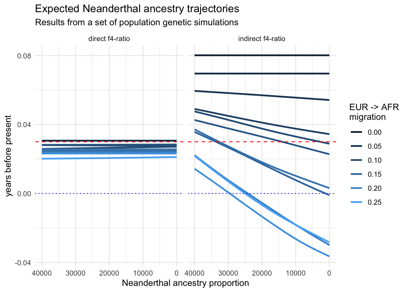
And that concludes the recreation of one of my “famous” PhD-era figures. It demonstrated that various statistics estimating the proportion of Neanderthal ancestry in Europe across tens of thousands of years can reveal false (nonexistent) decline over time due to various (unaccounted for) demographic factors. It also showed that one particular statistic, since then named “direct \(f_4\)-ratio statistic” is robust to these problems, and that statistic remains in use to this day. We now know that Neanderthal ancestry levels in Europe remained stable for tens of thousands of years.
I hope that you now appreciate how adding little bits and pieces, one step at a time, makes it possible to create beautiful informative visualizations of any kind of tabular data!
Advanced exercises
If you’ve already been introduced to ggplot2 before and the exercises above were too easy for you, here are a couple of additional challenges:
- Take a look at how the ggridges package can potentially improve the readability of many density distributions when plotted for several factors ordered along the y-axis. For instance, how could you use this package to visualize the (admittedly practically useless, but still) distributions of longitudes (on the x-axis) for all samples in our
metadata, ordered along the y-axis by the country? Note that you might also need to learn about ordering factors using the R package forcats.
As an extra challenge, try to make this figure as beautiful, colorful, and magazine publication-ready using ggplot2 theming
- Study how you could turn our visualization of total IBD vs number of IBD segments as a function of the degree of relatedness into a proper interactive figure using ggplotly. For instance, make an interactive figure which will show the exact count and total IBD, as well as the names of individuals upon hovering over each data point with a mouse cursor.
“Take home exercise”
Take your own data and play around with it using the concepts you learned above. If the data isn’t in a form that’s readily readable as a table with something like read_tsv(), please talk to me! tidyverse is huge and there are packages for munging all kinds of data. I’m happy to help you out.
Don’t worry about “getting somewhere”. Playing and experimenting (and doing silly things) is the best way to learn.
For more inspiration on other things you could do with your data, take a look at the dplyr cheatsheet and the ggplot2 cheatsheet. You can also get an inspiration in the huge gallery of ggplot2 figures online!
Additional resources
As with our introduction to tidyverse, there’s so much more to ggplot2 than we had a chance to go through. I hope we’ll get through some spatial visualization features of R (which are tightly linked with tidyverse and ggplot2 in the modern R data science landscape), but there’s much more I wish we had time to go through.
Here are a couple of resources for you to study after the conclusion of the workshop, or even during the workshop itself if you find yourself with more time and more energy to study.
Factors are both a curse and blessing. When dealing with visualization, often a curse, because our factors are rarely ordered in the way we want. If our factors are numerical but not straightforward numbers (like our
age_bincolumn above), their order in ggplot2 figures is often wrong. forcats is an incredible package which helps with this. Read about it in this vignette and then experiment with using it for figures in this session which featured factors.cowplot is another R package that’s very useful for complex composite figures. We touched upon it in this session, but only extremely vaguely. Study this introduction to learn much more about its features! You will never need Inkscape again.
ggridges is a very cool package to visualize densities across multiple categories. It can often lead to much more informative figures compared to overlapping
geom_density()plots we did in our session. Here’s a great official introduction to the package.