WIP: Extracting ancestry tracts, chromosome painting, and using admixture tracts and LD patterns for dating admixture events.
library(slendr)init_env()
The interface to all required Python modules has been activated.
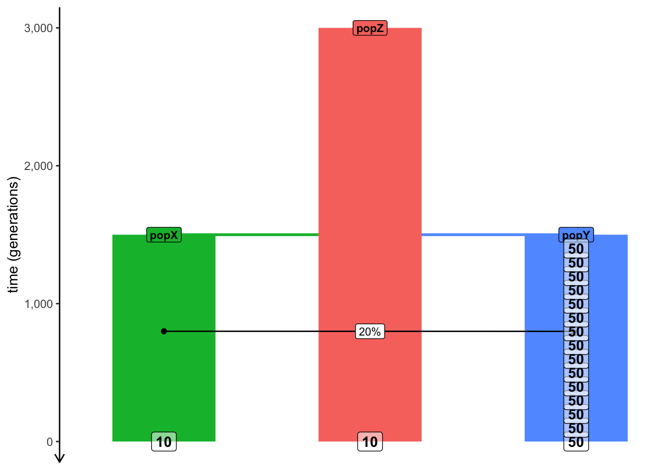
library(cowplot)# helper function for plotting tracts simulated laterplot_tracts <-function(tracts, ind) { ind_tracts <-filter(tracts, name %in% ind) %>%mutate(haplotype =paste0(name, "\nhap. ", haplotype)) ind_tracts$haplotype <-factor(ind_tracts$haplotype, levels =unique(ind_tracts$haplotype[order(ind_tracts$node_id)]))ggplot(ind_tracts) +geom_rect(aes(xmin = left, xmax = right, ymin =1, ymax =2, fill = name), linewidth =1) +labs(x ="coordinate along a chromosome [bp]") +theme_bw() +theme(legend.position ="none",axis.text.y =element_blank(),axis.ticks =element_blank(),panel.border =element_blank(),panel.grid =element_blank() ) +facet_grid(haplotype ~ .) +expand_limits(x =0) +scale_x_continuous(labels = scales::comma)}popZ <-population("popZ", time =3000, N =5000)popX <-population("popX", time =1500, N =5000, parent = popZ)popY <-population("popY", time =1500, N =5000, parent = popZ)gf <-gene_flow(from = popX, to = popY, rate =0.2, start =800, end =799)model <-compile_model(list(popZ, popX, popY), generation_time =1, gene_flow = gf)schedule <-rbind(schedule_sampling(model, times =seq(1500, 0, by =-100), list(popY, 50)),schedule_sampling(model, times =0, list(popX, 10), list(popZ, 10)))# Use the function plot_model() to make sure that the model and the sampling schedule# are defined correctly (there's no such thing as too many sanity checks when doing research)plot_model(model, proportions =TRUE, samples = schedule)
The following objects are masked from 'package:stats':

    filter, lag
The following objects are masked from 'package:base':

    intersect, setdiff, setequal, union
library(ggplot2)tracts <-ts_tracts(ts, census =800)
PopAncestry summary
Number of ancestral populations:    3
Number of sample chromosomes:       1540
Number of ancestors:            56552
Total length of genomes:        154000000000.000000
Ancestral coverage:             84000000000.000000
sample_times <-ts_samples(ts) %>%select(name, time)# adding haplotype ID and time (automatically done by the dev slendr)tracts <- tracts %>% dplyr::group_by(name) %>% dplyr::mutate(haplotype = dplyr::dense_rank(node_id)) %>% dplyr::ungroup() %>%inner_join(sample_times)
Joining with `by = join_by(name, time)`
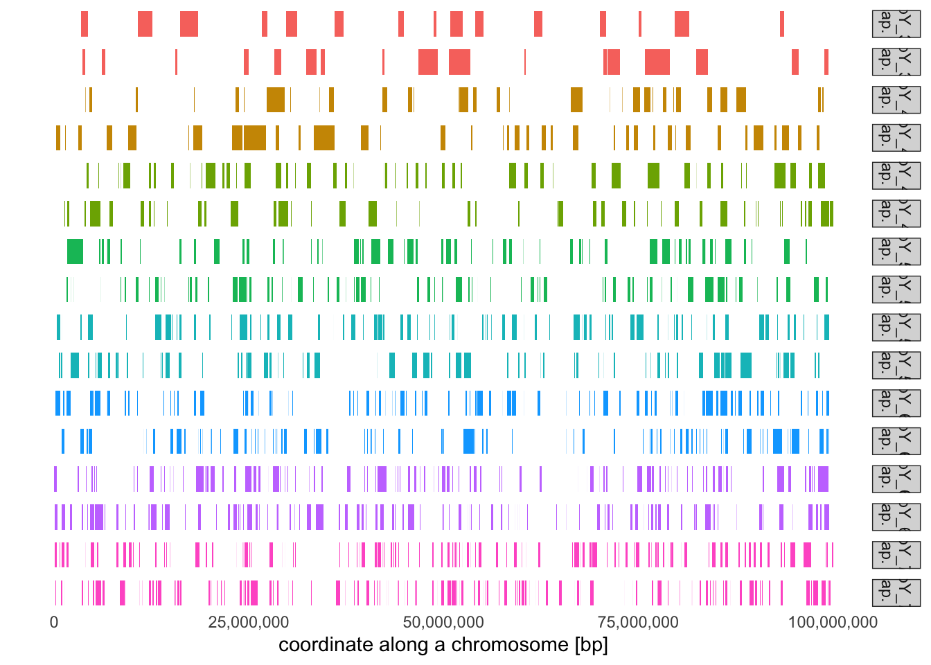
# Select sampled individuals from different ages (remember, we recorded oldest individuals# at 1000 generations ago, the youngest individuals at 0 generations ago). Use the function# plot_tracts to visualize their ancestry tracts. What do you see in terms of the number of# tracts and the length of tracts across these individuals? Can you eyeball some distinctive# pattern?subset_inds <- tracts %>%group_by(time) %>%distinct(name) %>%slice_sample(n =1) %>%pull(name)subset_inds
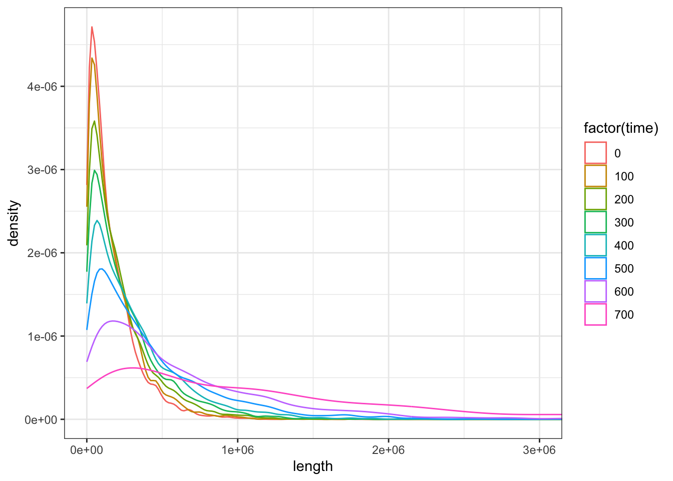
# It looks like the older individual is, the closer they lived to the start of the admixture event,# and the longer the tracts they carry will be. Compute the average length of a ancestry tracts in each# sample age group and visualize the length distribution of these tracts based on their age:tracts %>%group_by(time) %>%summarise(mean(length))
ggplot(tracts, aes(length, color =factor(time))) +geom_density() +coord_cartesian(xlim =c(0, 3e6)) +theme_bw()
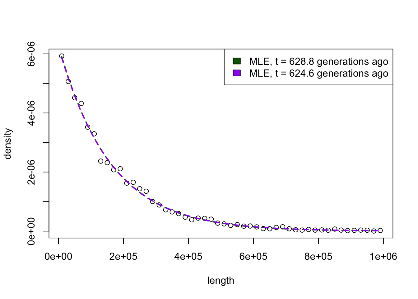
# Now, try to work backwards. Assuming you have the following distribution of tract lengths...tracts <-filter(tracts, time ==0, length <=1e6)bins <-hist(tracts$length, breaks =50, plot =FALSE)length <- bins$midsdensity <- bins$densityplot(length, density)lambda_mle <-1/mean(tracts$length)lambda_mle /1e-8